Artists use conscious skill and creative imagination to evoke emotion within their viewers and immerse them into their perspective and establishing this within their online portfolio is pivotal. We have curated a selection of outstanding portfolios from our Artists along with insights on which characteristics of Fabrik were their top-picks to help inspire and guide you when creating your online portfolio.
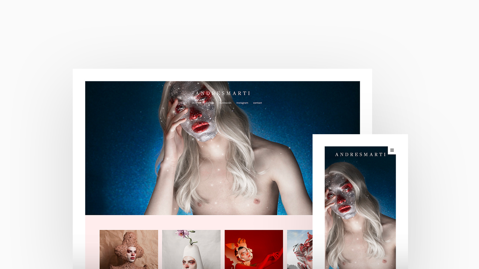
Andres Marti
Theme: Tocuyo
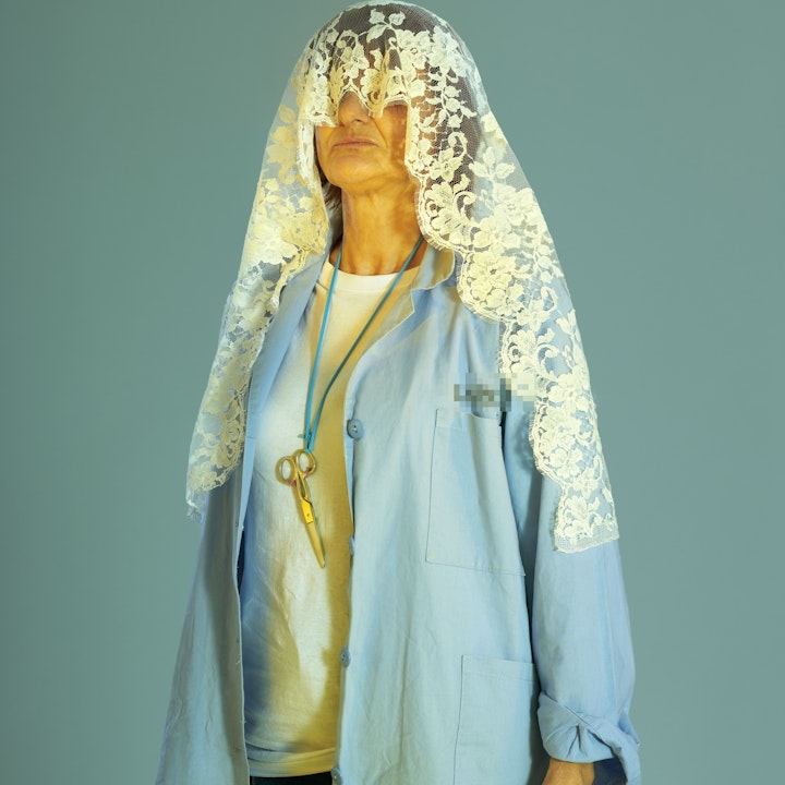
Andres Marti is a photographer and creative artist residing in Bogotá, Colombia. In his latest personal photographic series titled "Otredad" (Otherness), you can see hints of Baroque and Romanticism. The work relates to days that one is understood as a whole and other days where that whole is fragmented. Marti is using Tocuyo, with a cover with thumbnails homepage and stacked project layout.
"What I like the most about Fabrik is that it is a perfect canvas for my work where it shows detail in a very elegant way, my favorite function is the carousel at the entrance, it makes me feel very pro." -Andres Marti
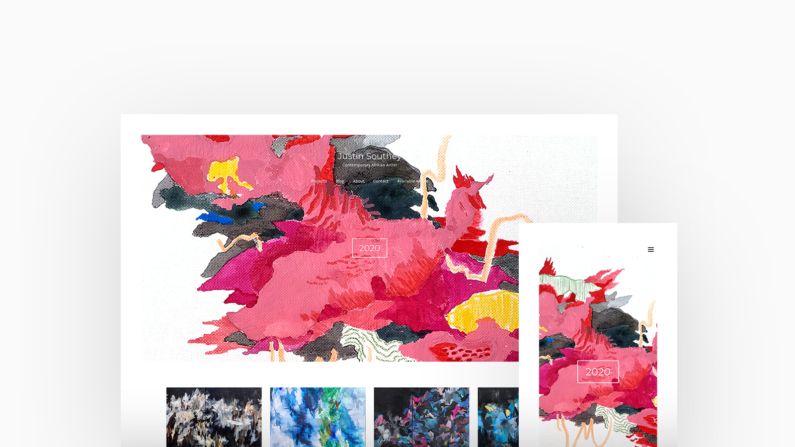
Justin Southey
Theme: Tocuyo
Justin Southey is a talented Abstract Artist, Illustrator and Designer and his practice explores notions of landscapes and fantastical worlds that serve as metaphors for more unquantifiable emotional and spiritual spaces. Justin is using Tocuyo with a featured with thumbnails homepage and stacked cover project layout.
"I love that Fabrik is simple and easy to use, and looks professional." -Justin Southey
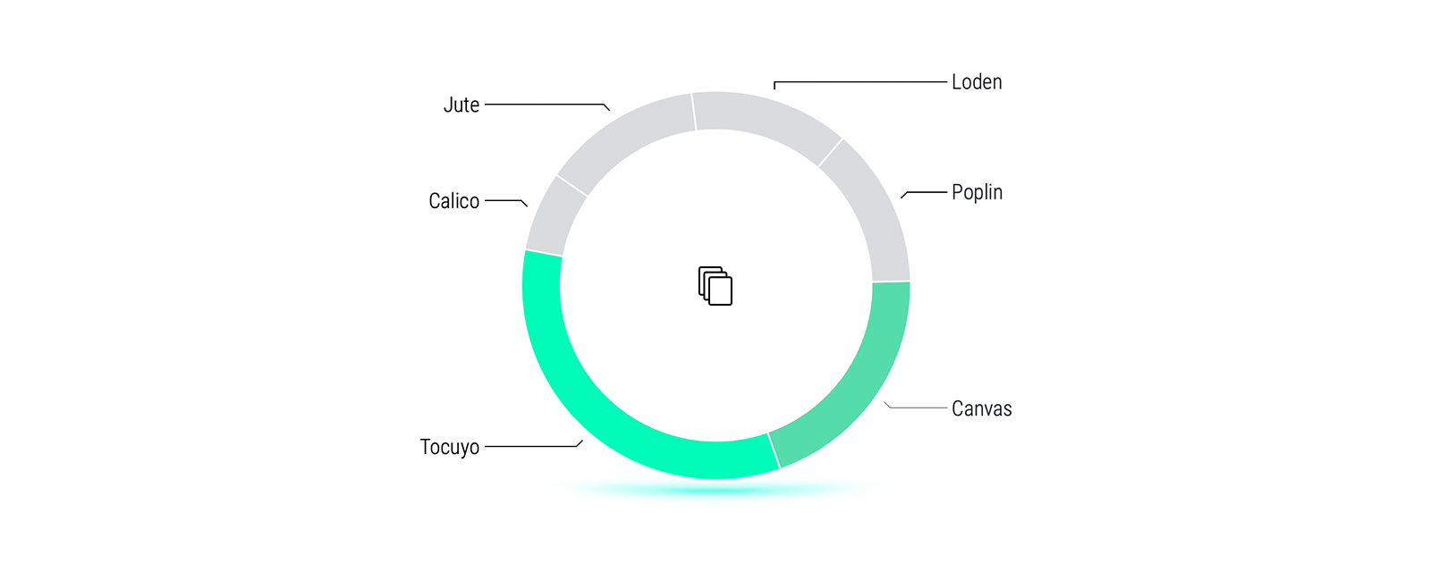
A third of our Artists prefer Tocuyo for their choice of theme.
Cover layouts within Tocuyo allows an Artists work to become truly immersive with a full-screen hero, thumbnail grids and inline About content - Perfect for them to introduce themselves as well as their work.
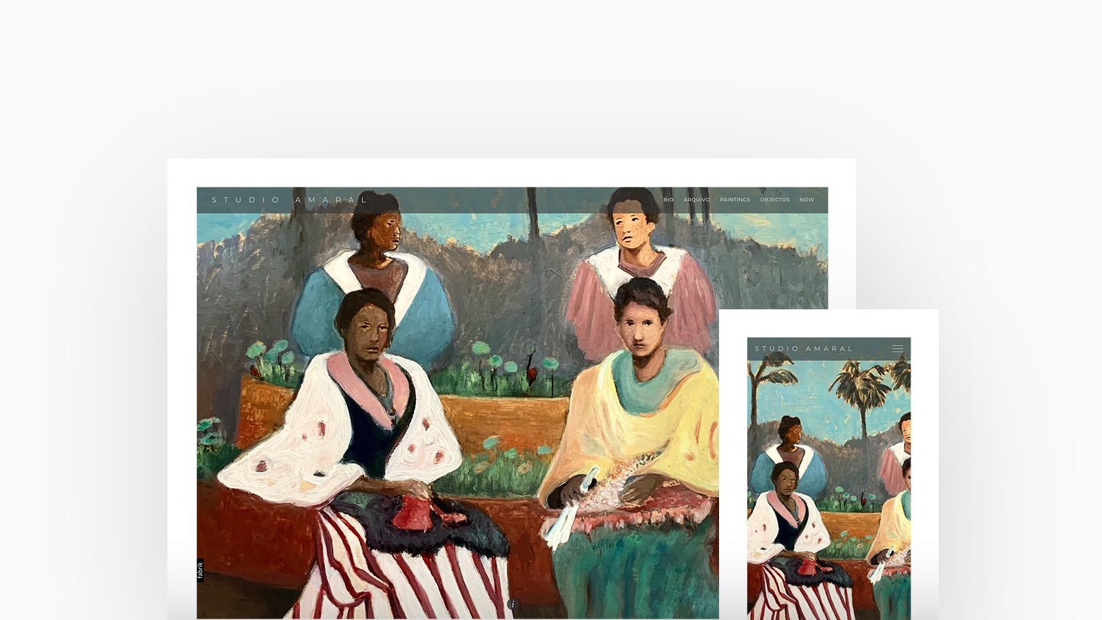
Studio Amaral
Theme: Loden
Portuguese artist Studio Amaral's portfolio is a sensory experience, canvases full of textural brush strokes and complimenting palettes of both lifestyle and landscapes. Studio Amaral is using Loden with a cover homepage and lightbox project layout.
Check Out Studio Amaral's Portfolio
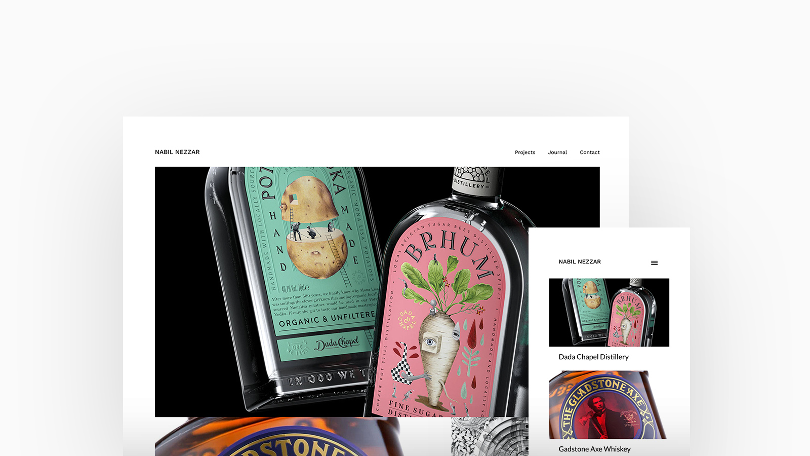
Nabil Nezzar
Theme: Calico
Nabil Nezzar is an Artist and Illustrator. In a world of watercolour, graphite and gouache, giving traditional media a contemporary twist, Nabil is known for photo-realistic painting and drawing of natural environment, portraiture, architecture, fashion and beyond. Nabil is using Calico, with a featured spotlight homepage and strip project layout.
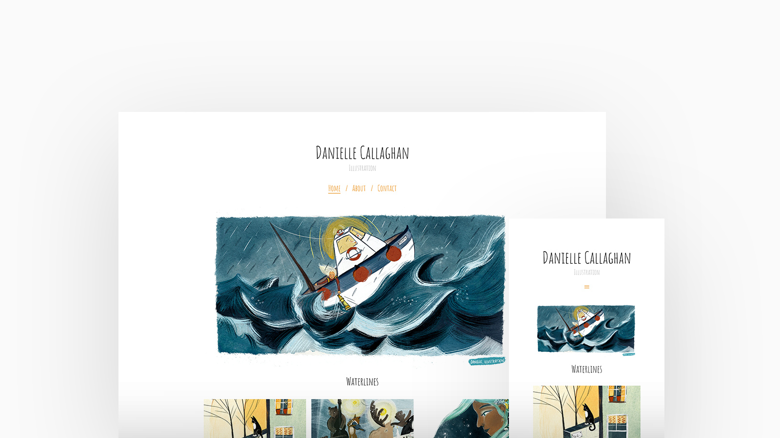
Danielle Callaghan
Theme: Poplin
Danielle Callaghan is an illustrator living in Edinburgh, Scotland. She especially enjoys illustrating stories featuring animal characters and the great outdoors and has worked on a variety of commissions, including children's books, merchandise and murals. Danielle is using Poplin, with a featured thumbnails homepage and gallery project layout.
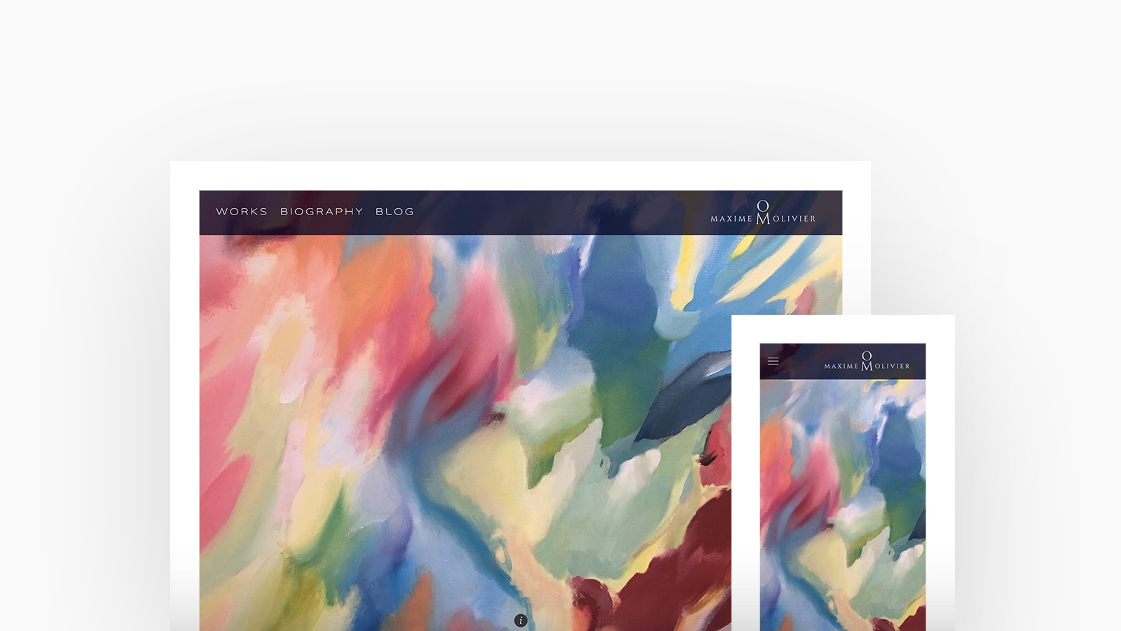
Maxime Olivier
Theme: Loden
Maxime Olivier is a large format painter who creates cosmic dimensions that transport the viewer to the very personal universe of the artist. Maxime is using Loden, with a cover homepage and slideshow project layout.
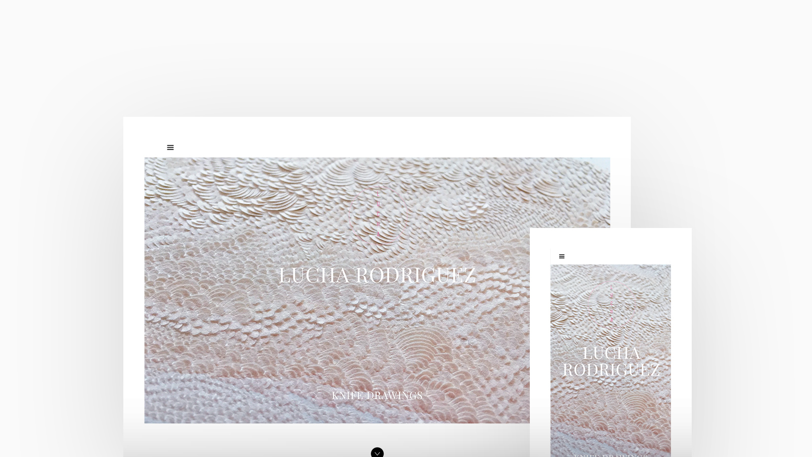
Lucha Rodríguez
Theme: Jute
Lucha Rodríguez’s work as an artist is a transitional tool to open ourselves to experiences and levels of awareness. It challenges perception and dimensionality through distortion and illusion. There is a disturbance from the proper original state of the material with a constant plane to space movement. Lucha is using Jute, with a featured blocks homepage and stacked project layout.
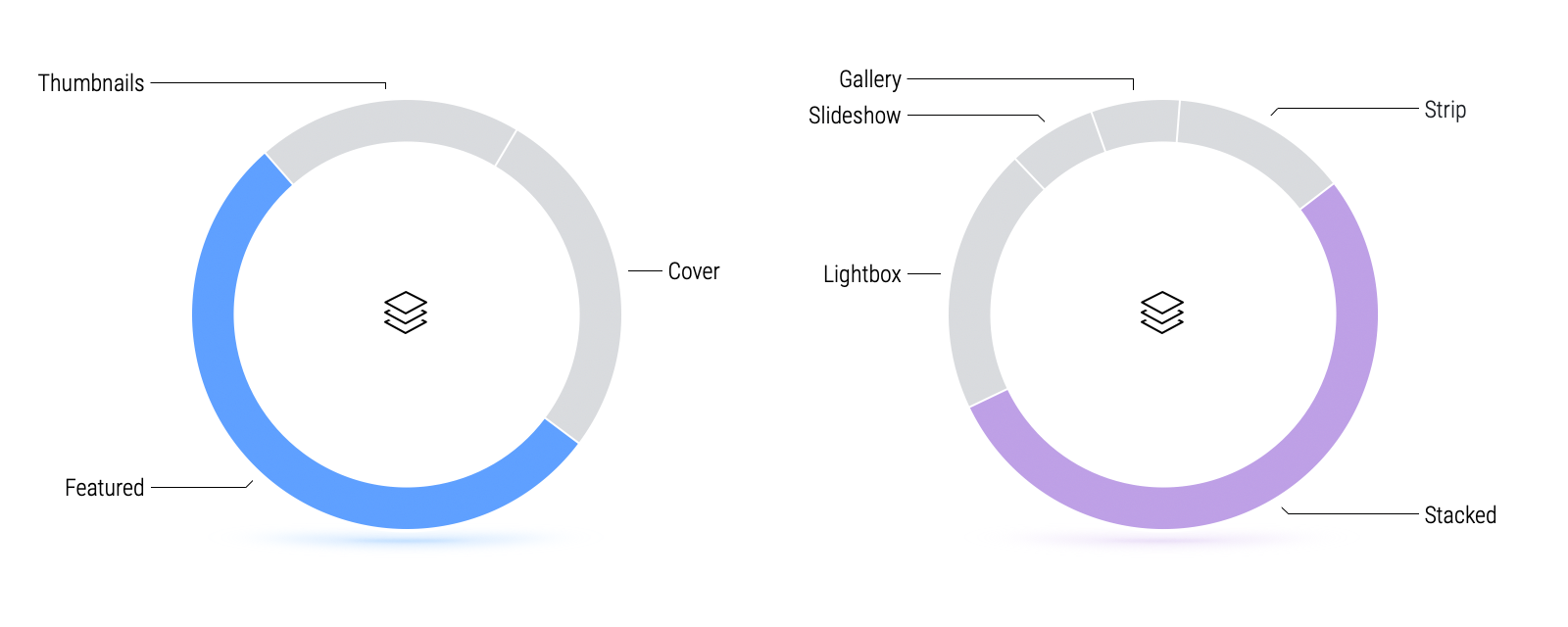
Over 50% of Artists favour a feature homepage layout with a stacked project layout.
Artists particularly love a feature homepage layout as it allows them to use a large or fullscreen hero area to display one, or several, of your projects in a slideshow setting the subject and tone of their work. A stacked project layout is a very simple and forgiving and allows for variety in the types and sizes of media you have.
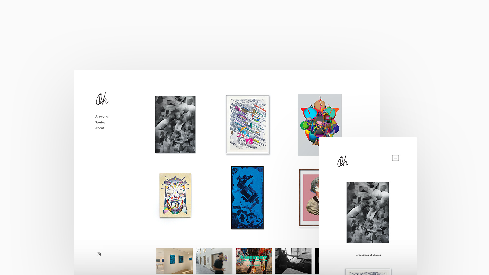
Oliver & Hans
Theme: Canvas
Oliver & Hans is an art collaboration between Oliver Abbey (Denmark) and Hans (Korea) whose artworks are made through a visual language embedded in a process of formal abstraction investigating the construction and subsequent deconstruction of form. Oliver & Hans are using Canvas, with a thumbnails homepage and stacked project layout.
"Digital media is part of the creative process - we can make quick changes to the artworks and send it back and forth to Seoul and Copenhagen using our website." -Oliver & Hans
Discover Oliver & Hans' Portfolio
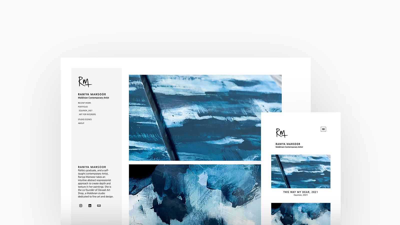
Raniya Mansoor
Theme: Canvas
Raniya is a politics graduate, and a self-taught Maldivian artist. With an intuitive abstract-expressionist approach, her art is connected to life, her Maldivian heritage, and a journey of wellness. She is the co-founder of Oevaali Art Shop, a Maldivian studio dedicated to fine art and design. Raniya is using Canvas, with a stacked homepage and strip project layout.
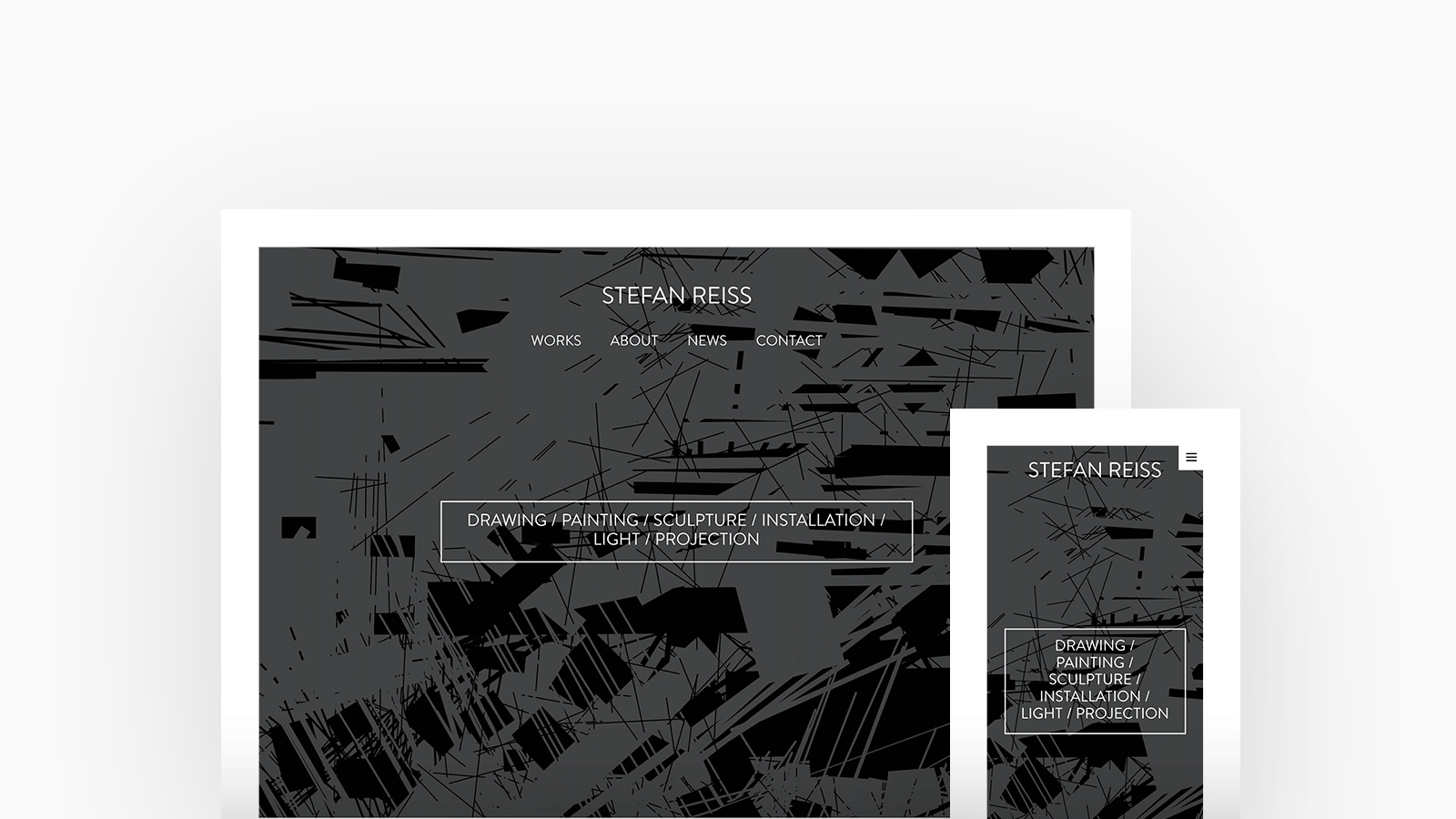
Stefan Reiss
Theme: Tocuyo
In his work Stefan Reiss has been researching for ten years in the fields of drawing, painting, sculpture, installation, projection and lighting. He develops specific works for the different media, which are mutually connected and establish contextual relationships between them. His artistic focus is to combine art and technology, research and innovation, immersion and experience. Stefan is using Tocuyo, with a featured with blocks homepage and lightbox project layout.
"As an artist I always have to change every part of my website at every time, because the series of my artworks change all the time. Fabrik is so comfortable and multifunctional at the same time. It’s unbelievable: I can reorganise my website immediately." -Stefan Reiss
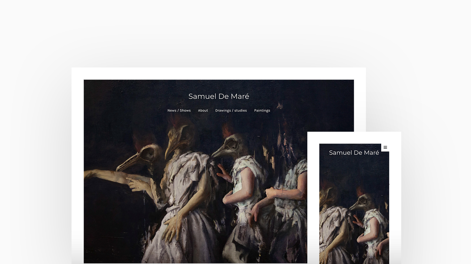
Samuel De Maré
Theme: Tocuyo
Samuel De Maré is a Painter, working and Living in Mechelen, Belgium. His paintings constantly change focus, taking different paths through a scene to try to capture his intention. Samuel is using Tocuyo, with a cover with thumbnails homepage and stacked cover project layout.
"As a painter, Fabrik was exactly what I was looking for in a portfolio site. It’s very straightforward and easy to update my portfolio with new works. So if I’m posting something on social it takes just a few minutes to add these works to my site." -Samuel De Maré
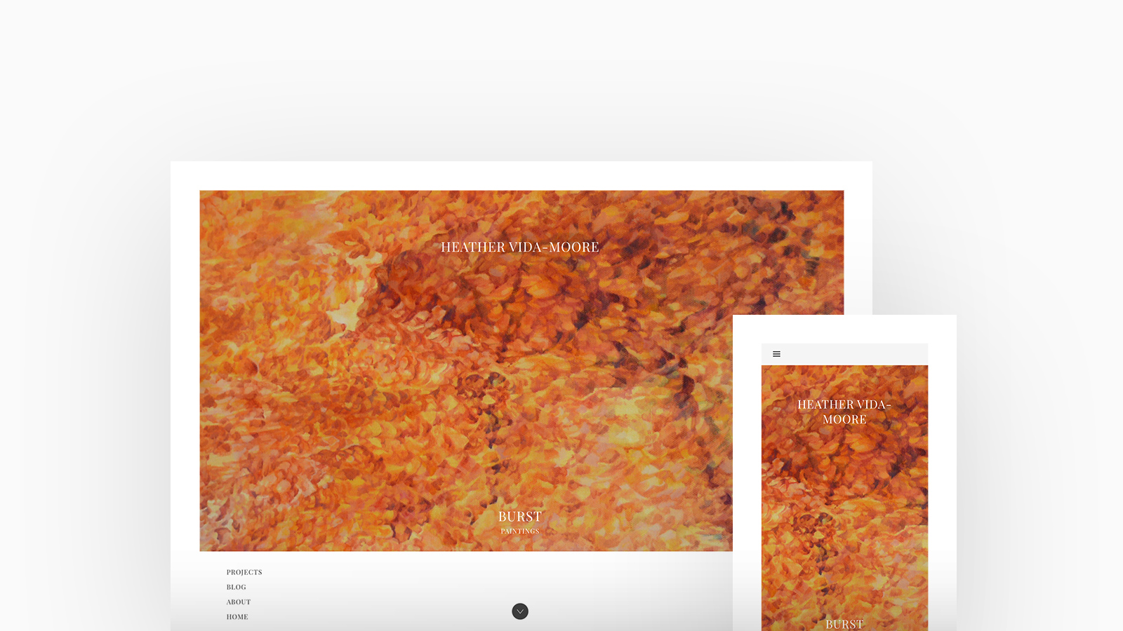
Heather Via Moore
Theme: Jute
Heather Vida-Moore is a visual artist from Hamilton, Ontario. She is primarily a painter whose work is often abstract, featuring complex, organic patterns, although she has also worked with a variety of other media, including drawing, sculpture, printmaking, digital art and video. Heather is using Jute, with a featured thumbnails homepage and stacked project layout.
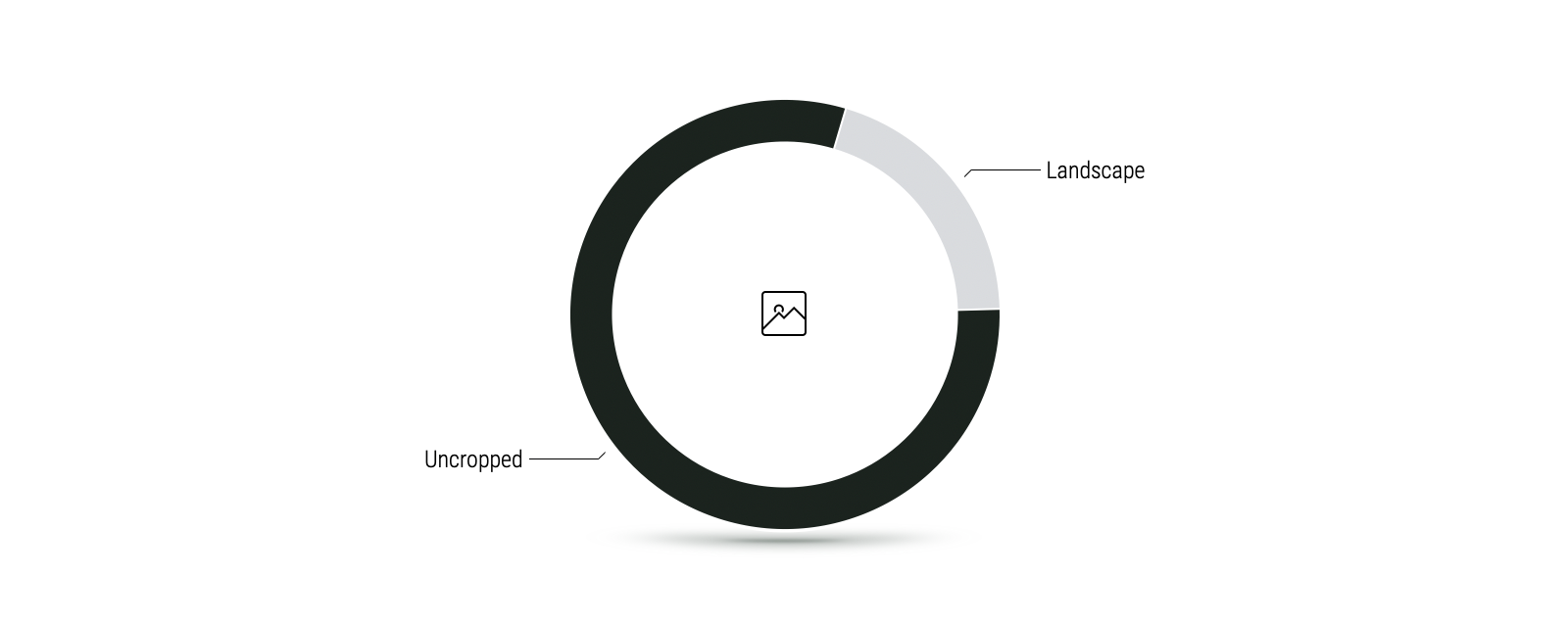
80% of Artists we surveyed prefer their artwork to be displayed uncropped.
Artists work in an array of different mediums and the majority opt for an uncropped ratio so that they can display their artwork in all it's entirety. This allows them to capture the viewers gage and fully immersive them into the thought process and deeper meaning behind their work along with giving viewers a similar experience to being present within an art gallery.
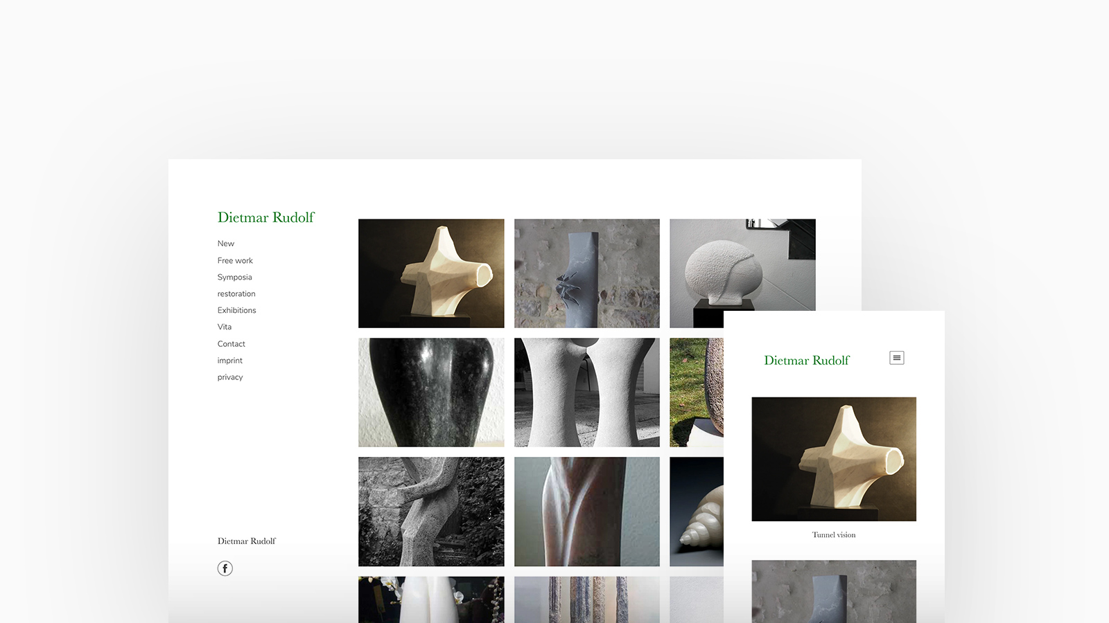
Dietmar Rudolf
Theme: Canvas
Dietmar Rudolf is a German Sculptor specialising in stark, minimal stone sculptures and restorations and has exhibited his work in several galleries. Dietmar is using Canvas, with a thumbnails homepage and lightbox project layout.
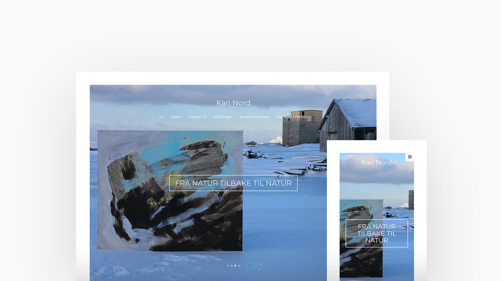
Kari Nord
Theme: Tocuyo
Kari Nord works with painting and gets in close contact with nature, a good flow in the process with her abstract images. The influence of nature in the artistic process and the interplay between Kari Nord's finished painting and nature - is her project. Kari is using Tocuyo, with a featured with thumbnails homepage and stacked cover project layout.
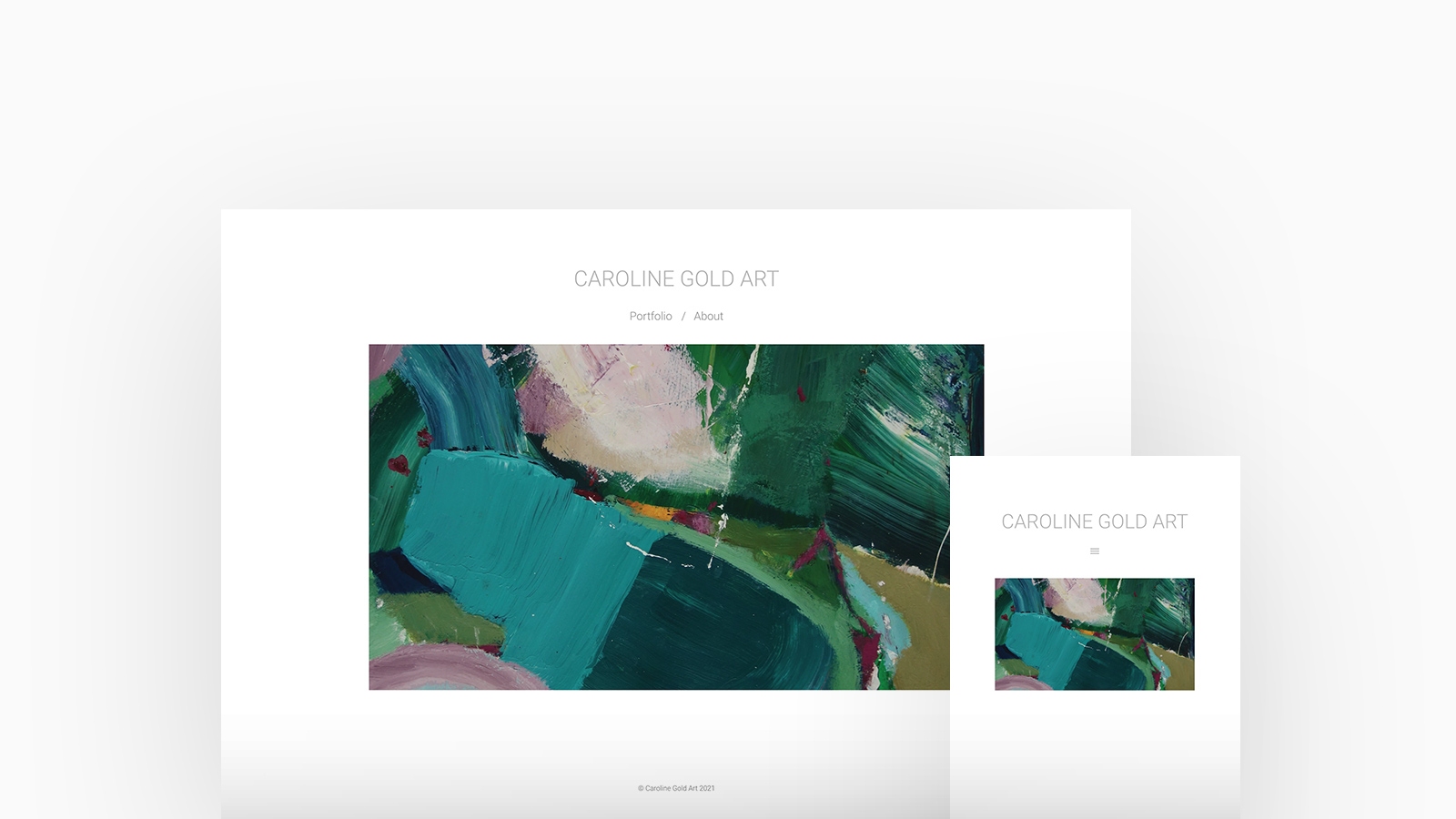
Caroline Gold
Theme: Poplin
Born in London, Caroline is an artist who now divides her time between her East Suffolk studio and Lewes. After a decade illustrating for clients, she began painting full-time and has exhibited in many galleries. Caroline is using Poplin, with a featured thumbnails homepage and stacked project layout.
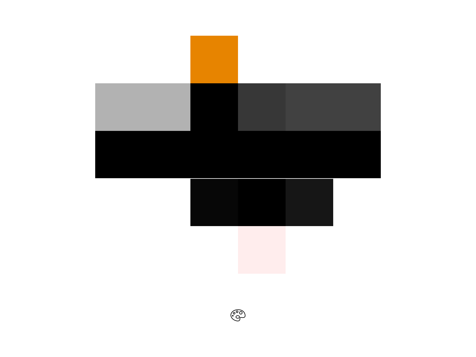
The majority of the Artists we surveyed favored a white background with black or grey text.
Artists often leave the colors and tone within their artwork to influence their portfolio and opt for a simple white background with black or grey text. Some Artists only use specific colors within their palette so may choose to incorporate a splash of this either within the text or as the background throughout their portfolio to compliment their artwork.
We pride ourselves making sure your work will always display beautifully on any device. Document your process and show off your art with a portfolio website that beautifully compliments your work.


