Put your energy into making sure your work gets seen and gets out into the world. My name's Tim: I’m a graphic designer, a creative director and I’m also the CEO of Fabrik. I’ve been presenting my work on the web since it was a fresh medium, and I’ve hired a lot of creatives based on the way they present theirs.
In this article I’ll share some pointers on how to create a beautiful portfolio website that will make your work shine and help you ace that job interview.
Preparing for a job
You’re putting your portfolio together to land your dream job. Whether you’re just starting out, you’re established, or you’re a master of your field you’ll need to focus your portfolio to the position you’re going for. This means you’ll probably want to re-order your portfolio in advance of each position you’re going for.
Bring out the work you’re most proud of, but also that most closely fits the position and output of the studio you’re going to see. Bear this in mind from the outset and make sure you’re working with a portfolio platform that gives you the freedom to rapidly re-focus, overnight if necessary.
Unless you’re asked to present a specific kind of media, use your online portfolio in your interview. Take your own laptop or tablet if you have it but make sure you feel confident to take control of your interviewer’s laptop should they offer it to you and navigate around your portfolio personally. When your portfolio is open in a tab on your interviewer’s laptop you’ve left the best possible reminder behind you. I’ve often gone a whole day before i’ve closed that tab, and I can easily conduct eight interviews a day.
"Personally I prefer to see fewer projects that you can talk about in detail than lots of projects you can’t (or won’t)."
We’ll discuss that a bit more in the second part but the more you can talk about your process the more passionate and engaging you’ll come across. You don’t need to be a salesman to sell yourself if you believe in what you’re doing.
The creative director who interviews you is very proud of the work their team outputs. Make sure you know the work, the house style and be ready to talk about how you’d fit into that. Culture and fit are incredibly important regardless of what position you’re aiming for; you’re joining a creative team.
Your portfolio will no doubt include work you produced as part of a team, make sure you communicate what you did, and what you didn’t, contribute to the project. Creative processes are all pretty much the same; your interviewer is more than capable of spotting when you’re over-exaggerating your input into a project.
Sometimes you’ll be asked a question you don’t know the answer to. It happens. Take a pause, be honest, and have a return. “Good question. I don’t have the answer to that but…” sounds a heck of a lot better than “Umm, well, errr…”. Your creative skill set includes your ability to think round a problem, it’s important to your prospective employer. If you don’t have the answer perhaps you know how you might find it. That’s you doing your best. Communicate that.
The Presentation Layer
With my own creative work I tend to look at it in two layers; the project layer and the presentation layer. For me the project layer is the project, and the deliverables. The presentation layer is how I (as the owner of my creative work) want the work to be seen by others.
For me the presentation layer is like a mini-project in it’s own right; it allows me an opportunity to look at my own work as an outsider and figure out how best to communicate it away from how it was originally intended. This is an essential skill when it comes to your own portfolio, and one that takes a bit of experience, and a lot of trial and error to perfect. When done right the presentation layer can be the common theme that runs through your portfolio that brings it all together; makes it a body of work rather than disparate items.
Don’t summarise yourself or your skill set with a graph. I see this from time to time; UI 50%, Illustration 70%, Infographics 55%, or Photoshop 75%, Illustrator 25% -that sort of thing. Any illustration that shows you as a percentage less than 100% is only showing me that you’re not as skilled as the guy who doesn’t. So steer clear of describing your skills like this, unless infographics are your business and you’ve found a particularly cute or clever way to present yourself.

Let your work do the talking
Explain your process, but let your work communicate your design solution. Your interviewer is an expert in understanding how creative work communicates its goals so briefly talk them through the brief and perhaps how or why the job landed in your lap to start with, and include enough content for them to figure out how you got from the brief to the solution.
I’m not a great fan of seeing all the decisions and routes you took that didn’t work, although I might ask you about that if it could be relevant.
"I’m keen to see how your solution plays out within its intended medium."
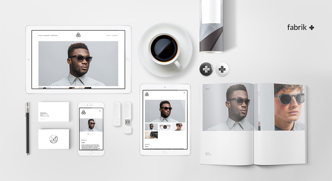
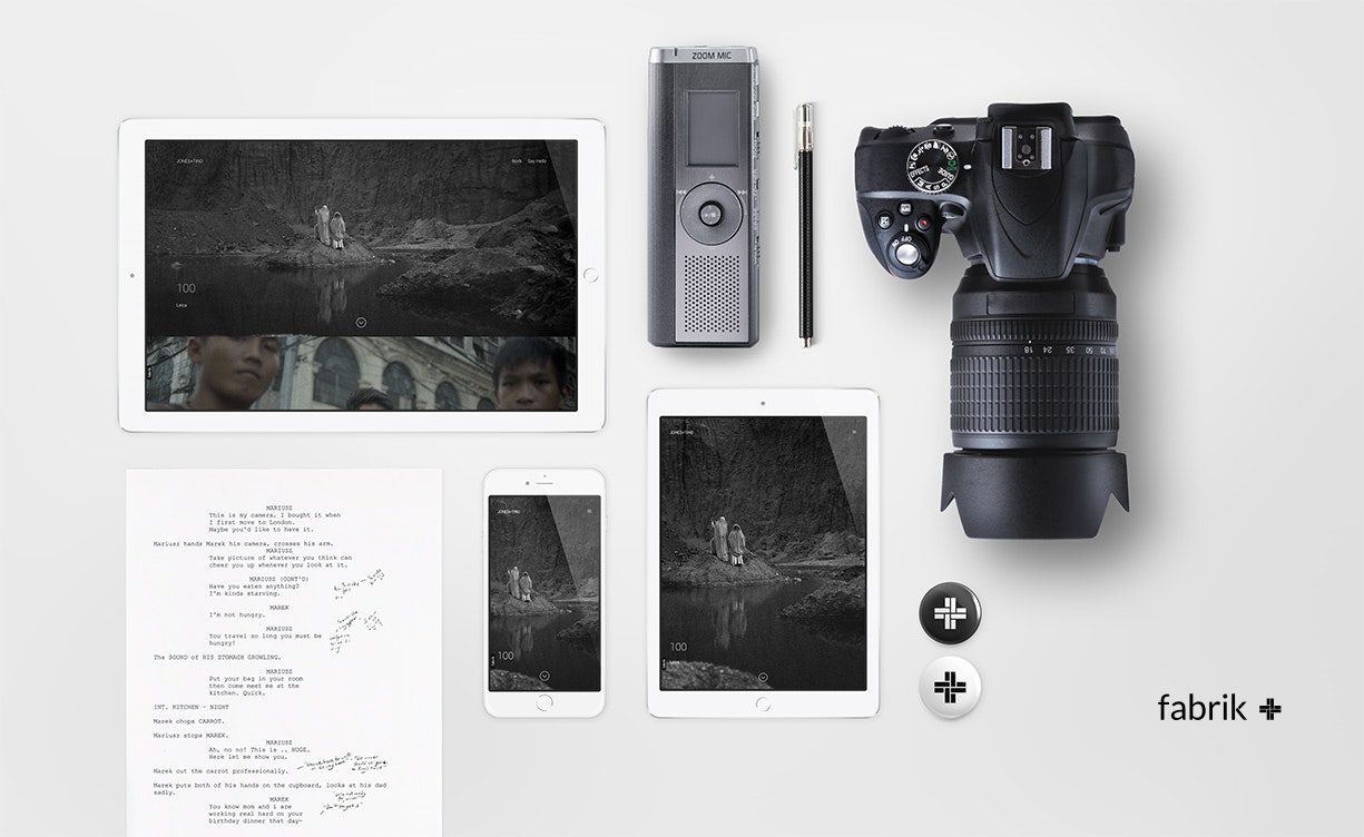
If it’s a website then I want to see how you dealt with different types of devices; mocking up your digital projects in real devices communicates your understanding of how it will be used. If it’s a branding or identity project I want to see how it looks in situ. If it’s a print or illustrative project I want to see how it looks when presented in the medium it was intended for; a photo of the printed article shows me this was properly thought through from start to finish.
If you’re not a great photographer or you don’t have access to awesome camera and studio kit you can cheat a little bit here, there are hundreds of resources online where you can download photo-real mockup kits for real-world scenes or digital devices for free or for just a few bucks. If it fits the way you want to present your work use them, and make a point of using your actual design output; that means no placeholder text or made up content.
And lastly on this subject — a little diversity goes a long way. Whilst you’ll benefit from focussing your portfolio towards the output of the studio, or the job position you’re going for, do show some variety in your work. It makes for a fresher conversation with your interviewer and shows that you’re able to deliver scope.
Get your files in order
If you’re working with photos or a video frame, use a JPG. if you’re displaying flat or gradient graphic work, identity and logo work or illustration use a PNG.
Use a program like Photoshop or Affinity Designer to optimise your images for the web. Use a GIF to loop a key part of your animation or video and choose just a few frames — otherwise you’ll end up with a very heavy site. Big files take time to download, and you want your site to be snappy; it keeps your visitors happy. Remember that your visitors could be using a mobile or a tablet and may not be on wireless.

Make It Yours
You are your brand, your brand is you. You get the idea. It doesn’t take much to create an online identity — a logo or a carefully selected typeface and colours. customise your site to make it more individual and then make your personal brand consistent across all the services that you use.
With your own site you have more control over how your projects and site are styled and personalised. As you establish yourself your portfolio should reflect your methodology as a creative — as I mentioned earlier in the presentation layer, the way you present your work communicates your flair for your craft as much as it does your personal style.
Take the time to test portfolio platforms to make sure you can find a platform that allows you to make your site really your own. From themes to typography to the structure of your portfolio and it’s customisation options, find that happy medium between what you’re comfortable editing yourself and something you can pick up after a couple of months to update easily.
Don’t present your own brand or your own portfolio as a project within your portfolio unless you’re a student, or you’ve got a very good reason to talk about it with your interviewer. In some infrequent cases it can be integral to your journey as a creative, but unless you explain it you’ll come across as reaching too deeply into the barrel to fill your portfolio.
Tim Jarvis is an award-winning creative director and co-founder of Fabrik and Frēsh. As CEO of Fabrik Tim supports and champions creativity; helping creatives find a voice and audience for their talents regardless of their background, geography or experience. You can find Tim’s work on his portfolio.


