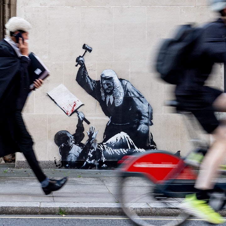
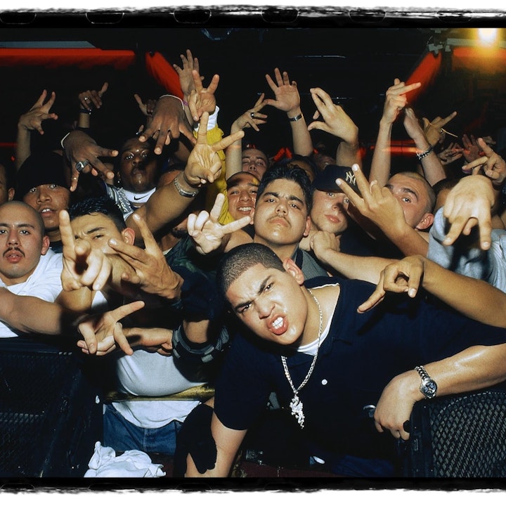
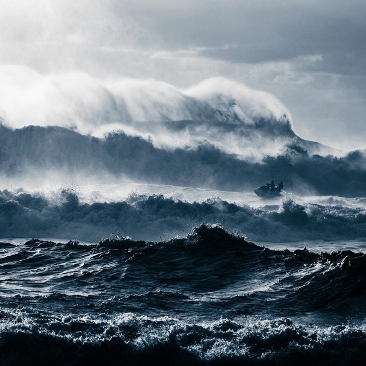
In the first part of this tutorial we focused on what makes an interesting, engaging or compelling cover image. The role of the cover image is to entice your viewers to look at your work. Whether it appears as a link shared on Facebook, Pinterest or Twitter, or whether your viewer is already browsing your portfolio this all-important image needs to hook your viewer in, and it needs to look right wherever that might be.
Devices
Fabrik is designed to look great on any device. From mobile to desktop or even TV and presentation screens, our themes allow your work to shine whilst giving your audience the very best possible experience, whatever they’re using to view your website. For this reason a cover image often has to perform the same task at different aspect ratios dependent on the device it is being displayed on.
For example a cover image set to a cinematic aspect ratio like 16:9 looks great in a landscape position on a desktop screen where it has ample space to communicate with the viewer, but on a smartphone that same image becomes a very small, thin item which isn’t engaging or easy to understand. For cover images we consider this to be undesirable because the cover image has a role to play in both promoting the quality of your work and in drawing your viewer further into your portfolio, rather than being a perfect representation of the piece. The cover image then resides at the point where the website as a functional item and your work meet, borrowing considerations from both.

As a general rule of thumb we tend to bring up the aspect ratio the smaller the screen gets - moving towards a much squarer image. When your cover images appears on smaller devices with these sort of aspect ratios you’ll find that the original image becomes cropped to the centre, meaning you’ll lose some of the left and right sides of your image.
Think about how your cover image will appear on handheld devices, which tend to have squarer, or more portrait screens. Some of the choices you may have made when following the rule of thirds or the rule of space might not be so effective here, so consider how your cover image will appear on smaller devices early on in your selection process.
In designing themes that will show off your work all we can do is give you the best probability that your cover image will exhibit your work on the largest amount of devices for the majority of your viewers whilst remaining relevant and engaging - your side of the bargain is to make sure the message gets across and to get the tone and the subject as perfect as you can, which has considerations when we start using text on images too.
Text & Imagery
Several of our themes use text over images to create a stronger bond between the fundamental functionality of your website and your work. Text over an image can provide a more emotionally engaging and contextually rich experience for your viewers. Cover images and hero images can often be very effective in leading viewers forward through your work for exactly this reason.
When we’re designing themes we think about how you’re likely to want to present your work, so different themes often explore options in the placement of text over images. We have themes that place text over the centre of cover images, or the top, or the bottom. Take your time to experiment with our themes and your cover images to create a portfolio that best fits the mood and feel of your work.
In marrying text and imagery there are some considerations with legibility that you’ll want to consider when putting them both together.
Text can be hard to read if your cover image is too busy. Typically the background of a photographic shot is less busy and easier to work with when placing text. Choose a cover image with large areas of solid colour or a simple colour tone in areas where it meets text. We discussed the tone and subject of your image in the first part of this tutorial where there are some pointers to help you find the right balance between your subject and the cover image as a whole.

Simon Ladefoged/Peter Riis
Using images that have significant contrast with the text is beneficial. Cinematic images tends to be darker than they are light, so if you’re a cinematic photographer or filmmaker you’ll probably want to use white text over your images. Darkening images with filters or an overlay element can be an effective way to ensure you are utilizing enough contrast, but most creative professionals tend to prefer their images unfiltered, so we maintain that choosing a great cover image is better than hiding it under layers of darkness.
Contrast can also refer to the size of text in relationship to what is happening in the image. Lettering should work with your cover image, not against it.
You may want to try an image that utilizes depth of field. This will allow a smoother backdrop for text, which will increase readability. You can try positioning out-of-focus portions of the image where it will meet text and be certain that the text color contrasts adequately with the primary color of the out-of-focus area.

Dan Sadgrove
Working with the visual flow of an image is one of the most important tips when it comes to working with text and photos. You need the text to fit logically with your cover image. Think about how your viewer reads the content or subject of the image and how that relates to the text that appears with it.
Interestingly you can create intriguing or bold covers for your projects by intentionally obscuring the subject of your cover image with text. A person’s face or the subject you want showcase can often look dramatic and interesting if purposefully obscured, and this approach is often used in contemporary fashion and style imagery. The mood conveyed here is confident or confrontational; you’re making the viewer work for that tap through to your project so you better make it worth their while!
The Important Bits
The rules of composition are a great starting point but keep in mind that cover images are versatile; the smaller the device your viewer is using, the more likely a landscape image is going to be cropped to the centre.
You’ll never go wrong by keeping your subject in the centre of the frame. If you’re featuring faces you’ll normally safer keeping the eyeline obscured from text overlays if it’s in the top half of your image.
Tonality is important. Photographers and cinematographers will benefit from simple, gentle tones in conveying the mood of the work and in creating a more versatile cover image. For the bold stylists, graphic artists and designers amongst you use contrast and full saturation if it suits your work but be mindful about how text may be placed over cover image.
Filmmakers, crop out the black bars.
Play with our themes; see how your cover images look. You can easily change themes at any point so it’s a good idea to try them out after you’ve added some projects to see what works best.
Use your site’s onfabrik.com address to view it on different devices like your phone or tablet before you show it to the world. This will give you a better idea of how your cover images look when they’re presented on smaller devices.
The simpler a cover image is, the more versatile it will be, but obviously it needs to represent your project so focus on an image which really sums it up in one shot.
If you have a lot of projects think about how your cover images work when displayed together. Subject scale and complexity in your images become important here. Aim for harmony.
Rules can be broken. Be bold and experiment. Nobody knows your work better than you do so present it in a way that makes sense to you. When you’re ready to show your work to the world add #onfabrik to your tweet so we can see what you’re made of.


