Designers show creativity in their ability to produce a sense of feeling within the visuals or products they create alongside being able to think outside of existing ranges - Their portfolio is no different. We have curated a selection of leading portfolios from our Designers along with insights on which characteristics of Fabrik were their top-picks to help inspire and guide you when creating your online portfolio.
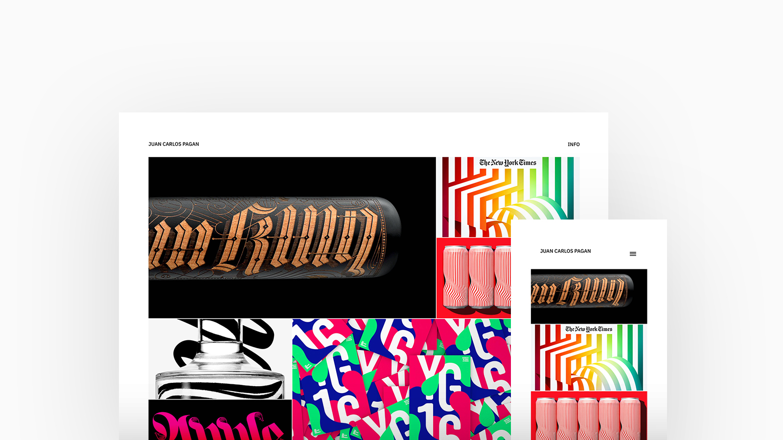
Juan Carlos Pagan
Theme: Calico
Juan Carlos Pagan is a New York based Artist, Designer, Typographer, and Creative Director who is currently the founding partner of Sunday Afternoon, a design studio and artist management agency representing top talent. Juan is using Calico, with a spotlight homepage and stacked project layout.
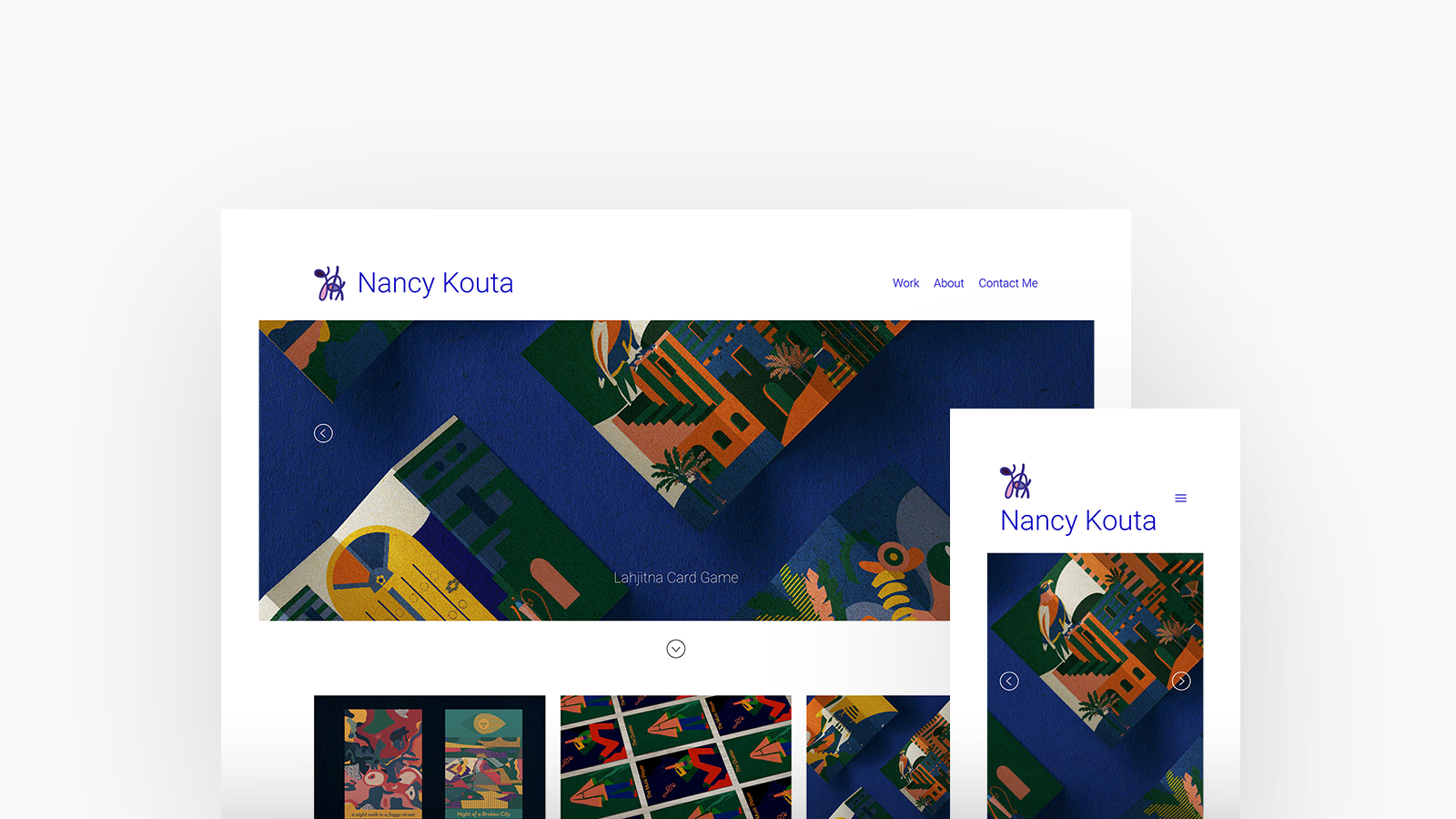
Nancy Kouta
Theme: Airdura
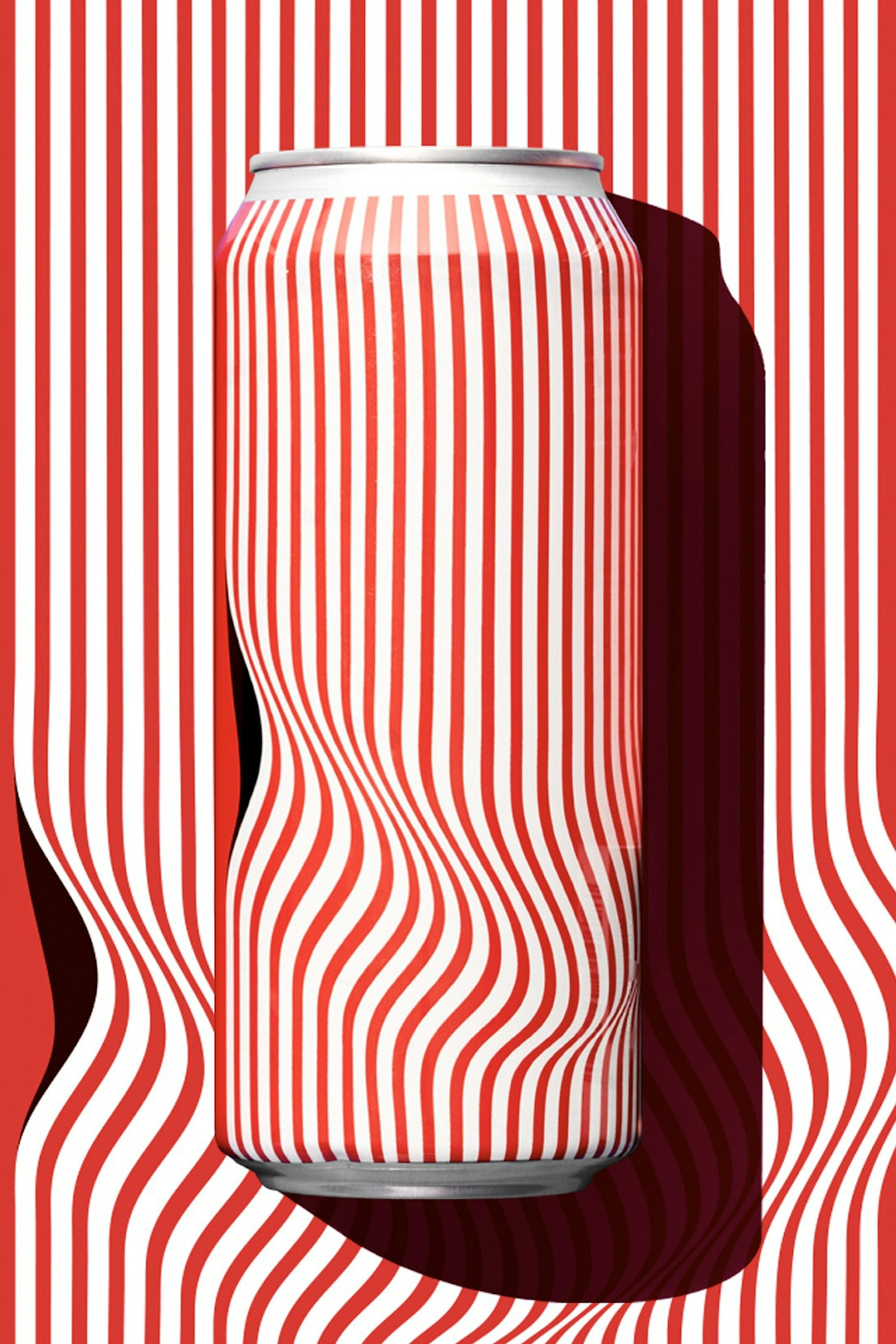
Nancy Kouta is a Graphic Artist currently based in Beirut. Interested in the magical perfect imperfection of nature and space patterns, Nancy's style is a blend of abstract forms and organic geometric shapes with bold vibrant colors. Her visual explorations designs are a mixture of real yet surreal little stories and allusions stuck together to form a whole. Nancy is using Airdura, with a featured thumbnails homepage and stacked project layout.
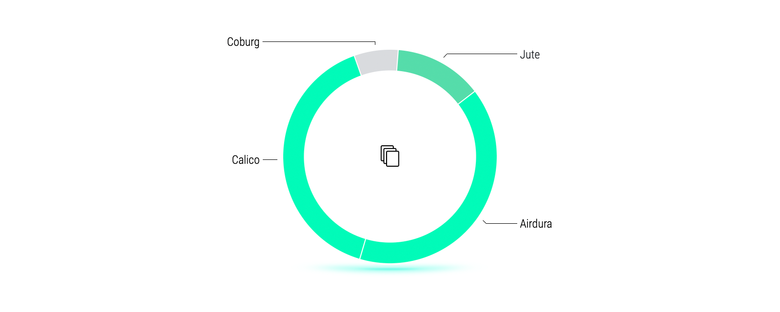
Split 50/50, the most popular themes with Designers are Airdura and Calico.
Both themes allow Designers to fully immerse their individuality and creative flair into their portfolio. Airdura is perfect for those wanting to display full-width imagery and unique block styles whereas Calico is eared towards showcasing longer-form projects with customisation options that will allow Designers to emphasise their creativity.
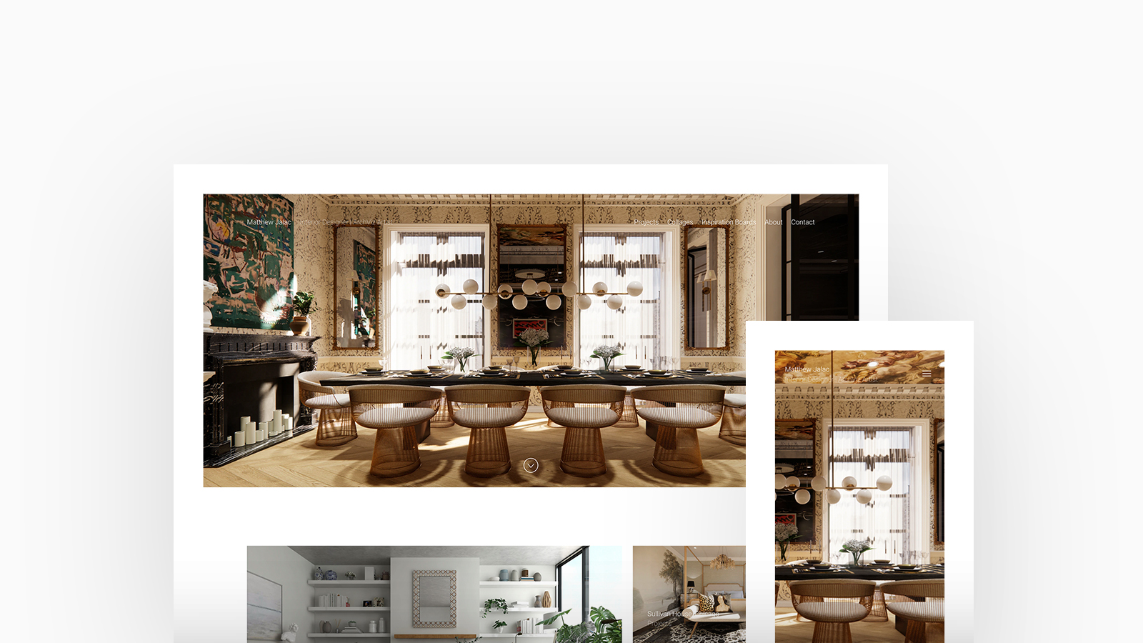
Matt Jalac
Theme: Airdura
Matthew Jalac has been curating beautiful interior landscapes for his clients since 2015. He loves to play and layer various textures, prints, colors, and finishes to create a personalized mood for every client. Matt is using Airdura with a cover spotlight homepage and stacked project layout.
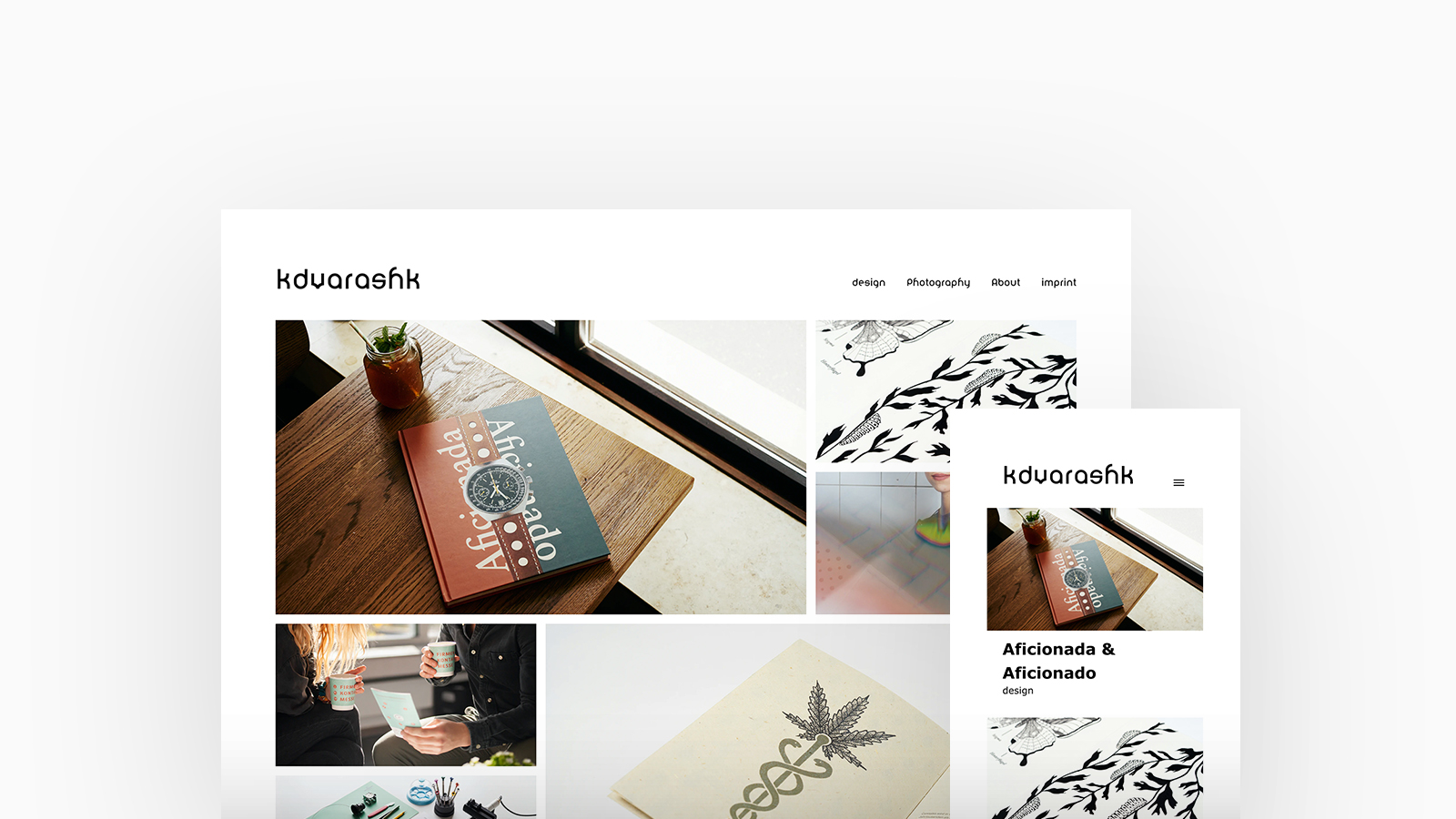
Keyvan Varashk
Theme: Calico
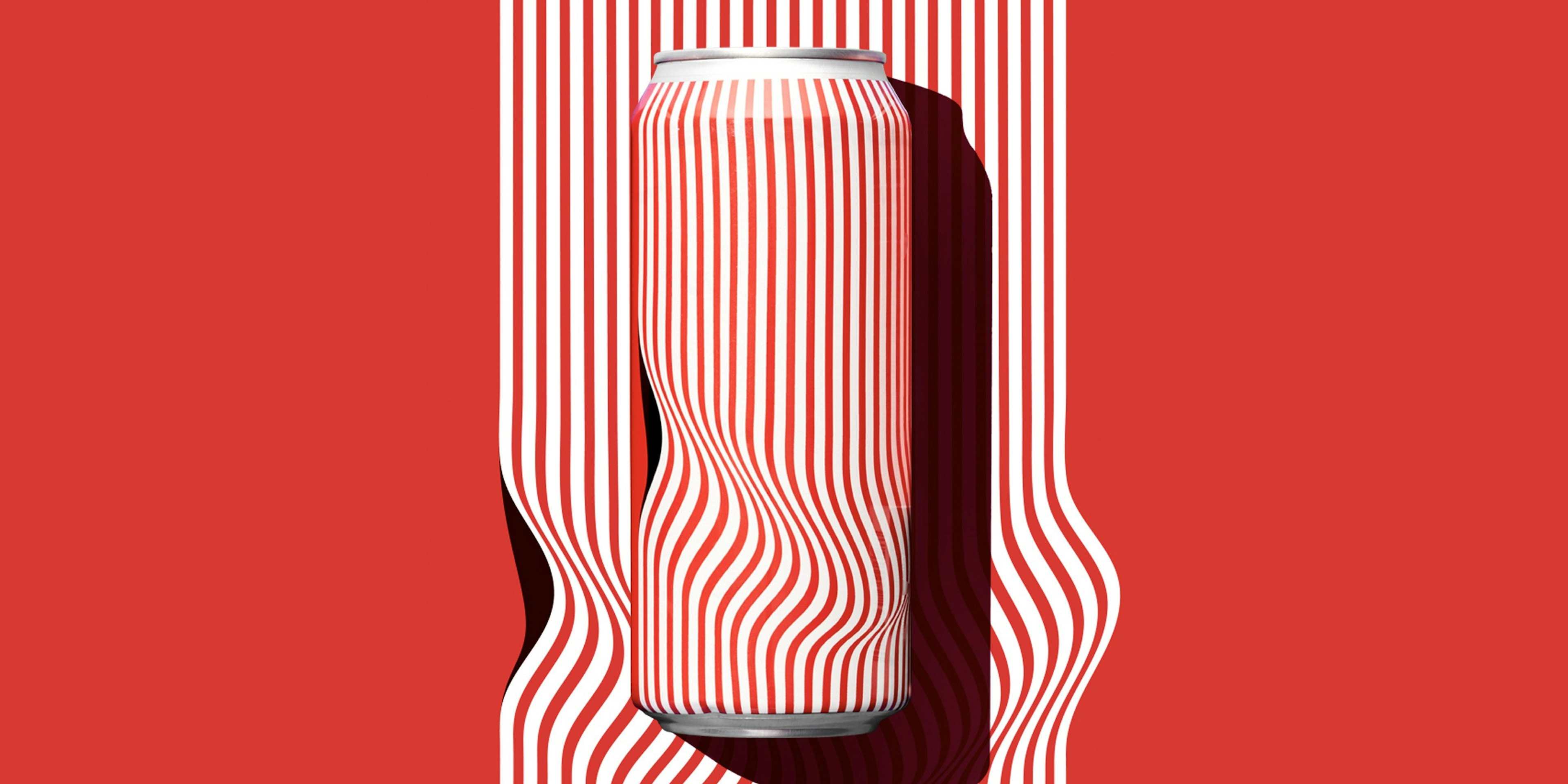
Keyvan Varashk is a Designer and Photographer who creates for books, fonts, branding, interface and social media. He prides himself on telling stories and bringing out the ephemeral and the invisible. Keyvan is using Calico, with a spotlight homepage and stacked project layout.
"I'm blown away by the quick and good support and Fabrik in general. As a freelance designer and photographer I can highly recommend them!" - Keyvan Varashk
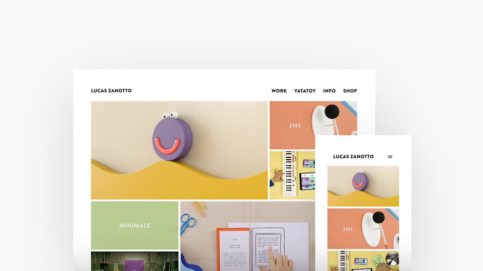
Lucas Zanotto
Theme: Calico
Lucas Zanotto is a Designer, Animator and Director although isn’t your standard Animation Director; yes, his graphic design and architectural background has led to meticulously crafted 2D work that’s won prestigious animation awards. Lucas is using Calico, with a spotlight homepage and stacked project layout.
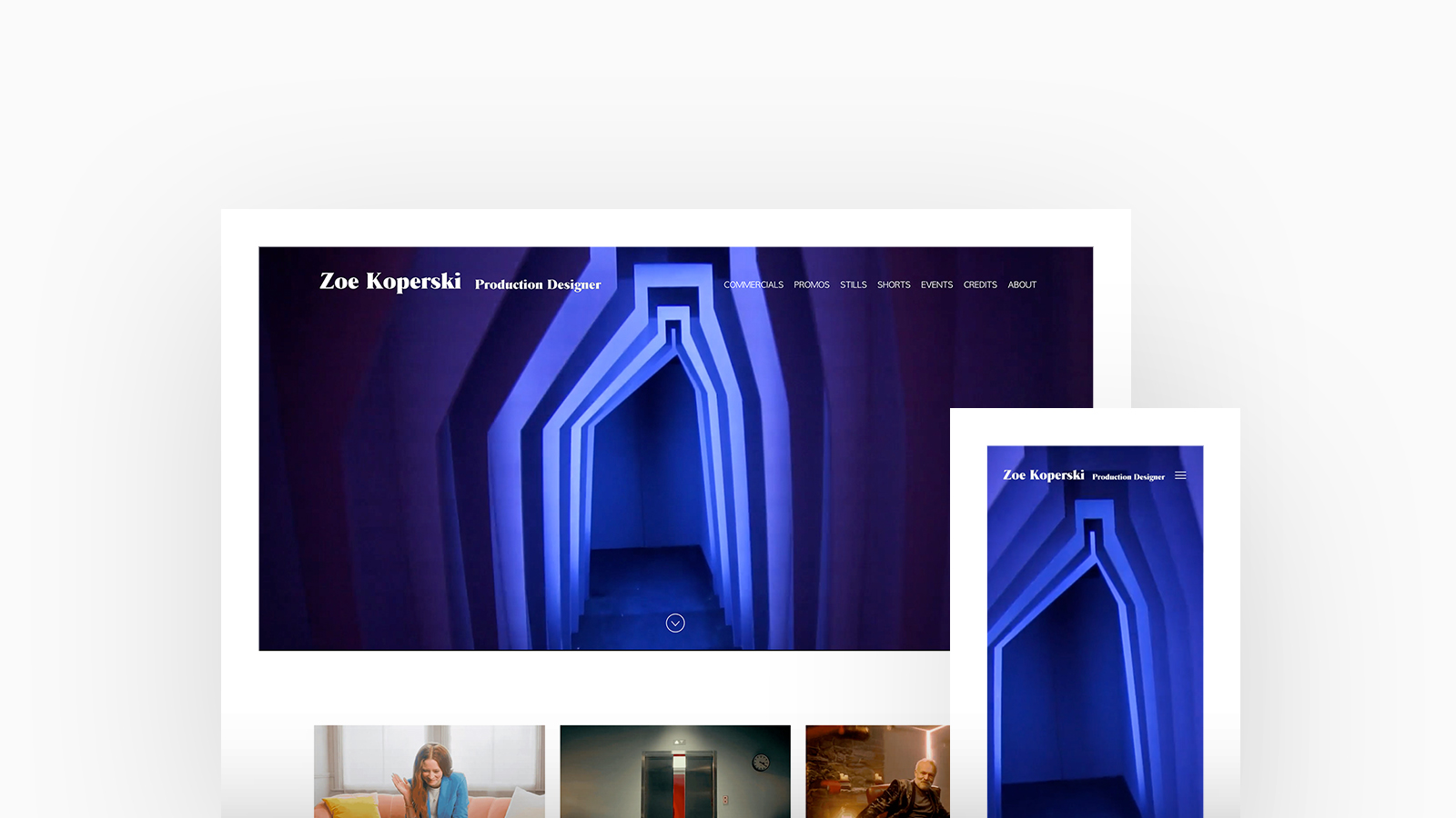
Zoe Koperski
Theme: Airdura
Zoe Koperski works as a production designer for commercials, immersive productions and film. Today, her background in psychology and fine art, tied with an intimate approach that offers a wealth of emotions to the viewer, means that she is a sought after designer and consultant. Julia is using Airdura, with a cover with thumbnails homepage and video thumbnails project layout.
"Beautiful layouts, and amazingly quick and helpful guys. You can chat to them on the site within minutes and they always help me out when I'm stuck or with custom settings. I've recommended them to a few people now and everyone loves them." - Zoe Koperski
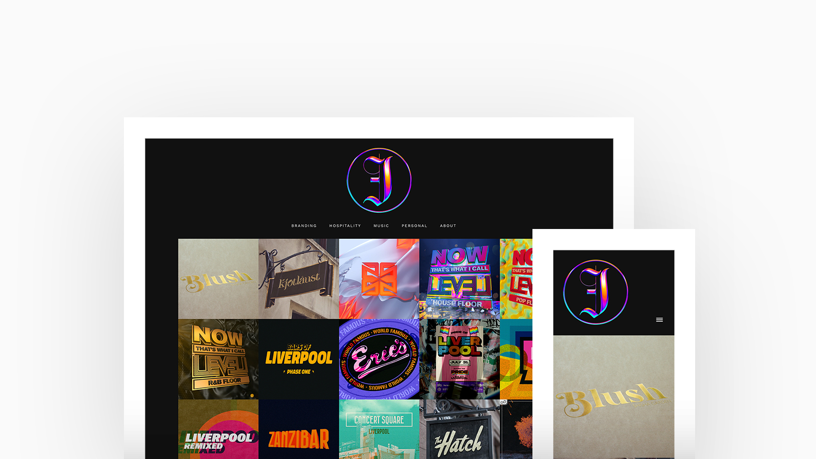
Jake Clarke
Theme: Calico
Residing in the UK, Jake is a multidisciplinary Digital Designer with a huge passion for the music. His clients consist of well-known brands within the music idustry such as Ark Patrol, Heroic Recordings, Redbull Studios and more. Jake is using Calico, with a thumbnails homepage and stacked project layout.
"Fabrik gives me a platform to effortlessly upload and organise my content with a click of a button, coupled with a variety of themes with a truckload of customisable parameters. No coding knowledge? Not an issue." - Jake Clarke
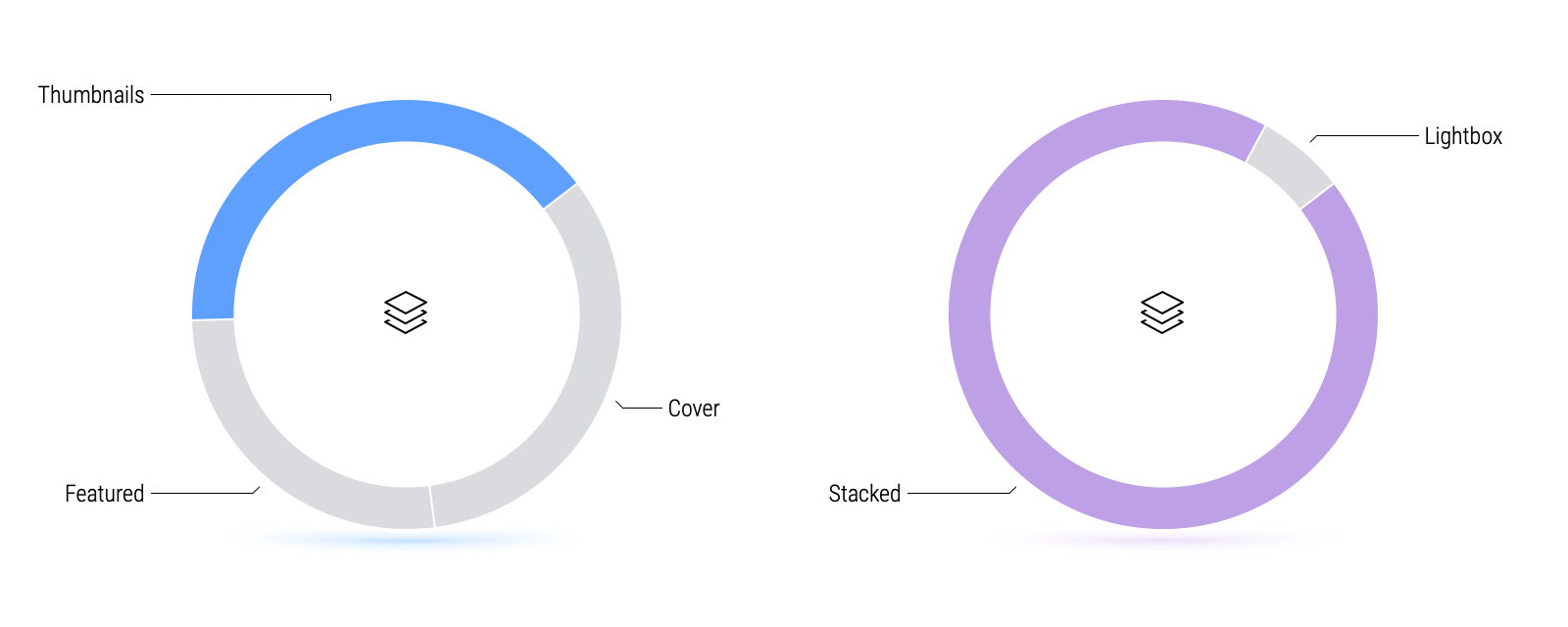
Designers prefer to display their homepage in a Thumbnails layout complimented by a Stacked project view.
Simple is best. Designers are rarely restricted by specific sizes of media and it's clear to see why a Stacked project layout is favoured as it adheres to those with media of varying aspect ratios alongside a clean, simplistic feed style view.
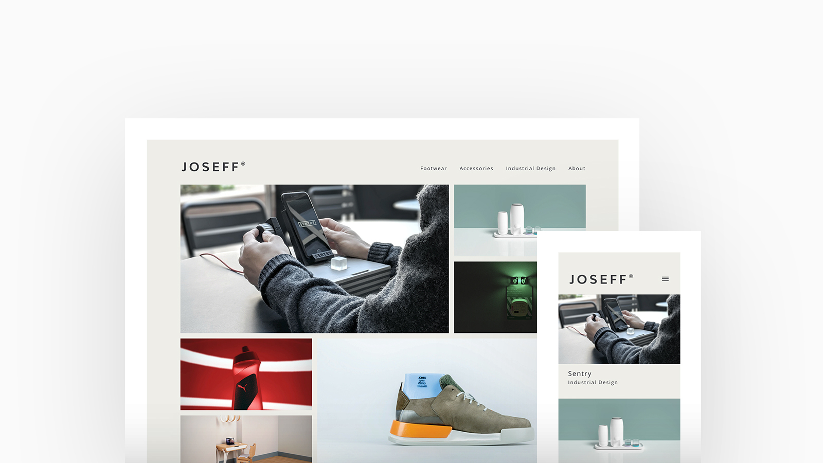
Joseff Ryland
Theme: Calico
Joseff Ryland is an Industrial Designer with work and experience within Product, Footwear and Accessories. His motivation is to create ethical, sustainable and responsible products and technology. Joseff is using Calico, with a spotlight homepage and stacked project layout.
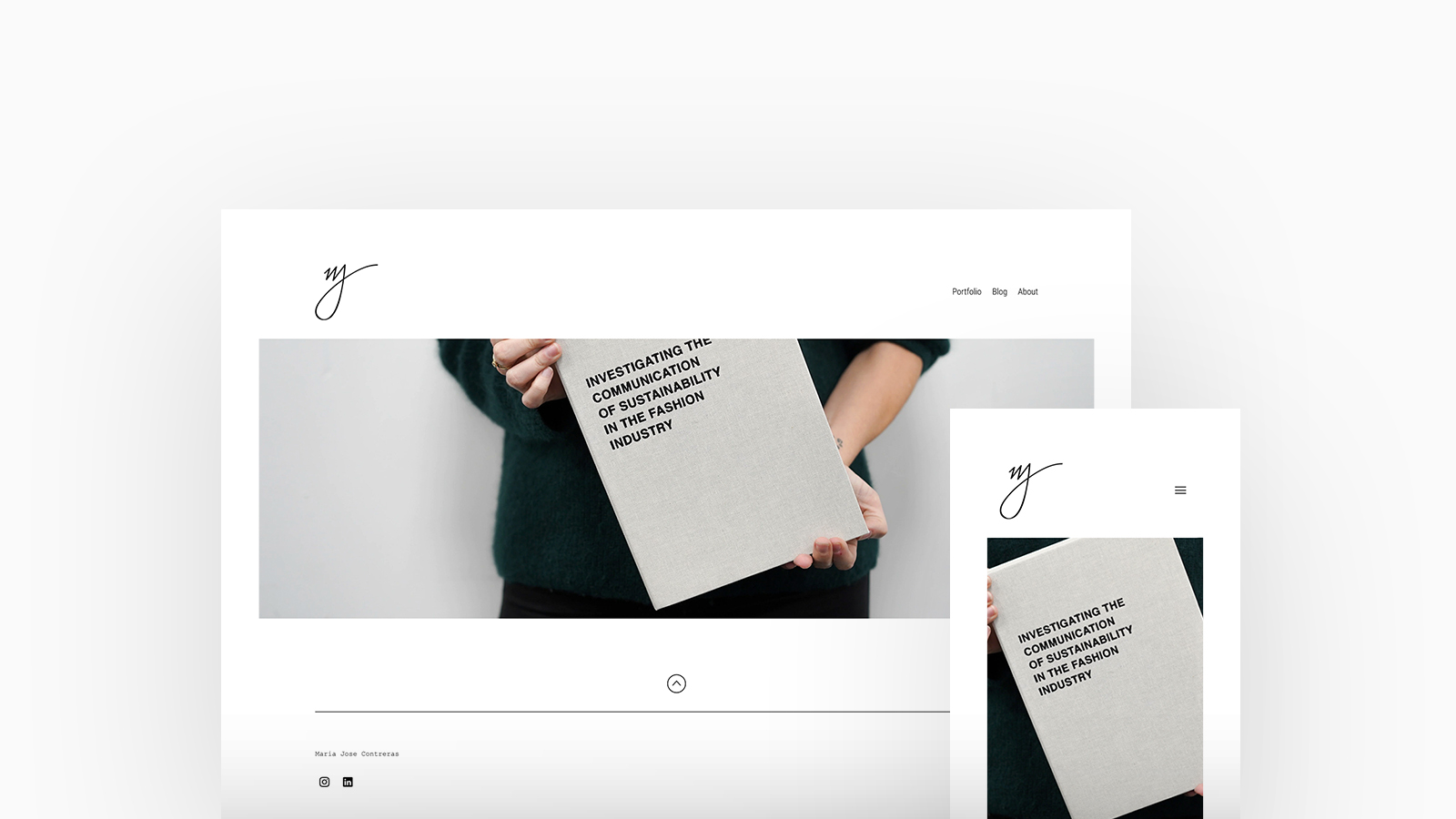
Maria Jose Contreras
Theme: Airdura
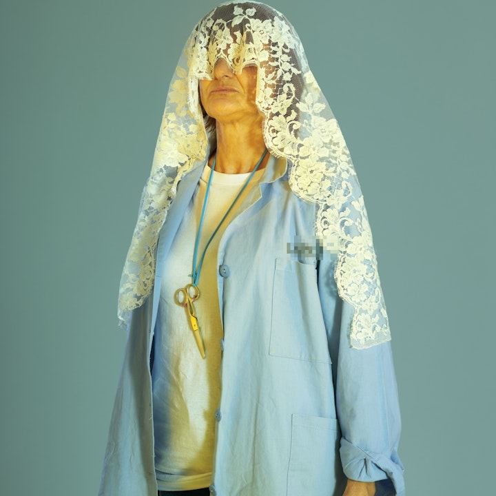
Maria Jose Contreras is a communication and content strategist currently based in London. With a unique background where Fashion, Theatre, and Photography merge, my creative practice has always been inspired by the search for truth in people and their relationships, both with the environment, with other people, and with themselves.. Maria is using Airdura, with a cover with thumbnails homepage and stacked project layout.
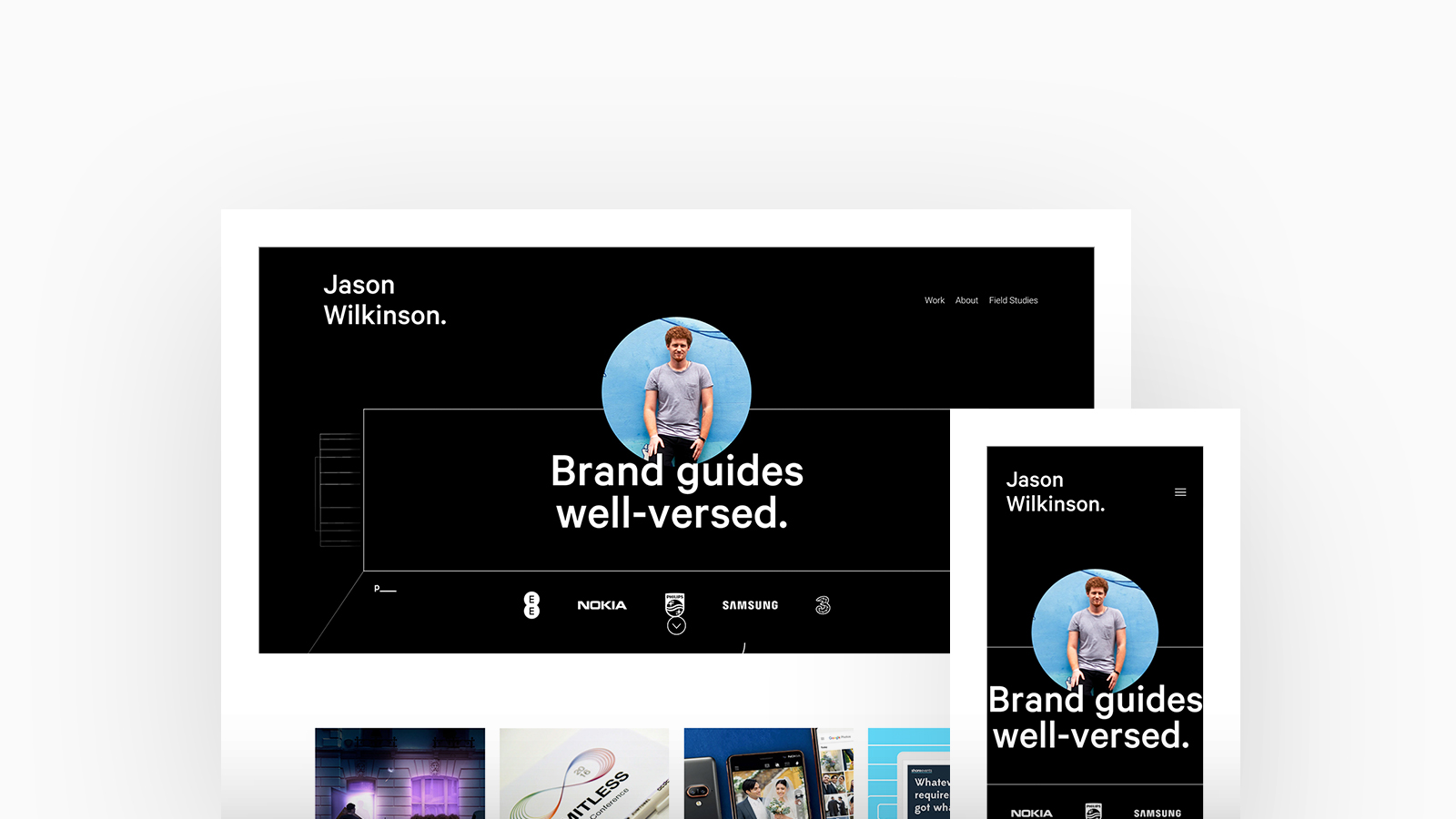
Jason Wilkinson
Theme: Airdura
Jason is a Creative Designer and music lover currently living and working in Brighton whose portfolio spans across brand identity, campaign design and print media. Jason is using Airdura with a cover with thumbnails homepage and stacked project layout.
"Amazing support, flexible layouts and friendly UI. A level above the rest!" - Jason Wilkinson
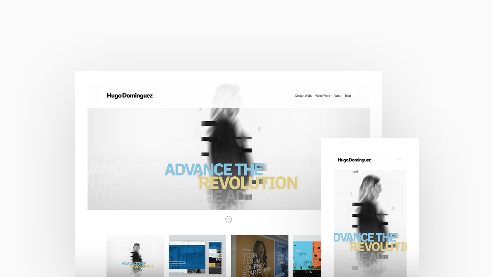
Hugo Dominguez
Theme: Airdura
Hugo is a Designer based in Chicago who loves his craft and is intrigued by the process along with the journey of each individual project he creates. He is well-rounded in all assets of design, be it Web, UX, Print, Wvents, Video and Photography. Hugo is using Airdura, with a featured with thumbnails homepage and stacked project layout.
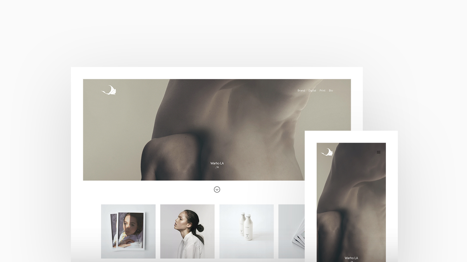
Tim Jarvis
Theme: Airdura
Tim is an award-winning Creative Director who thrives building creative relationships with photographers in fashion, film, and brand direction along with artisanal producers, artists and jewellers. Each allow him room to experiment and express his love for minimalism, typography and graphic design methodology. Tim is using Airdura, with a feauture with thumbnails and stacked project layout.
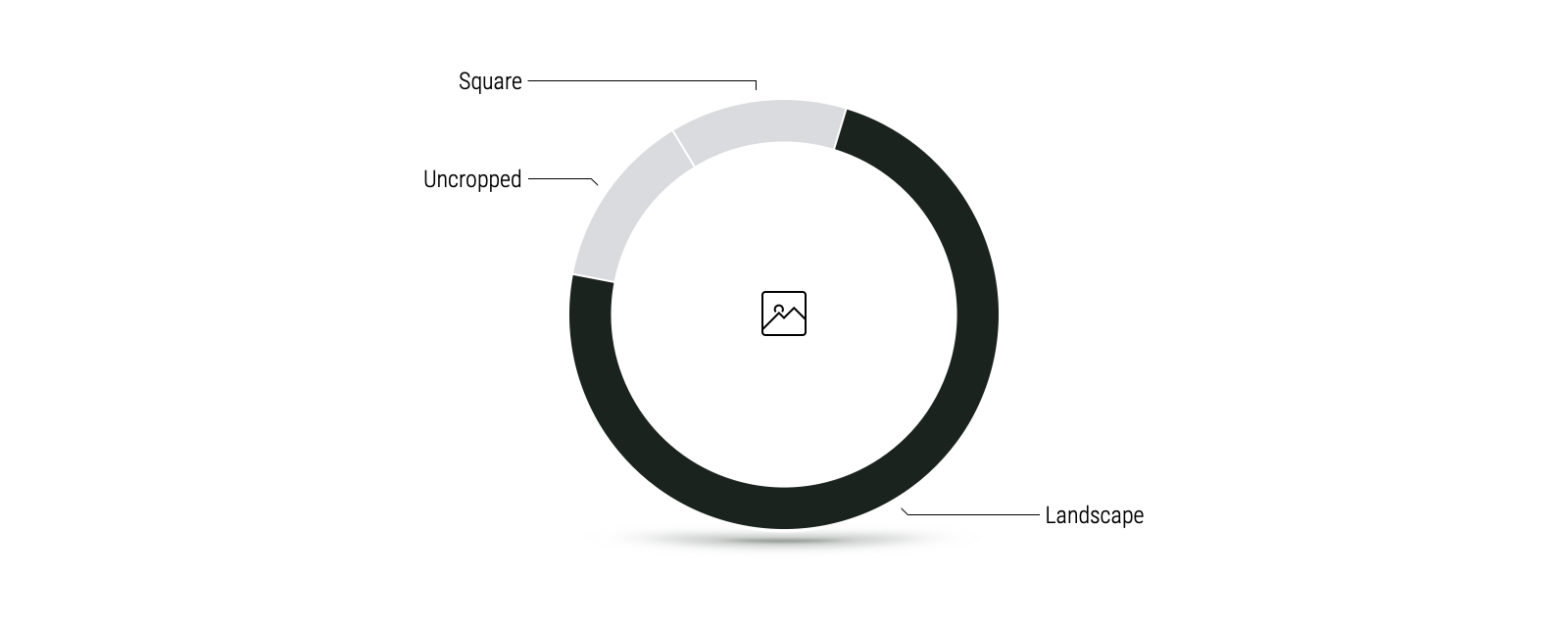
Over 70% of Designers we surveyed preferred the use of a Landscape image ratio.
Although Designers are rarely bound to specific aspect ratios, they do favour continuity and a landscape image ratio allows them to display their projects with cohesion, giving an overall aesthetic to their portfolio.
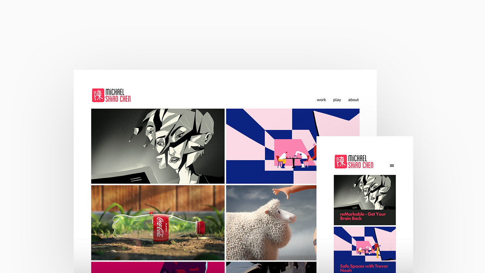
Michael Shiao Chen
Theme: Calico
Michael is a Director, Designer and Animator currently based in Sydney. He aims to bring out a cross-cultural mix of Eastern and Western influences - ranging from his own upbringing and time spent living and working abroad in Japan and Vietnam. Michael is using Calico, with a thumbnails homepage and stacked project layout.
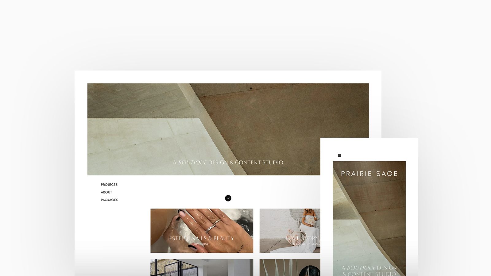
Prairie Sage
Theme: Jute
With a passion for minimalism, photography and graphic design, Prairie Sage specialise in distinctive branding design and social media content creation to help those to discover their brand story and voice. Prairie Sage is using Jute, with a cover thumbnails and stacked project layout.
Check Out Prairie Sage's Portfolio
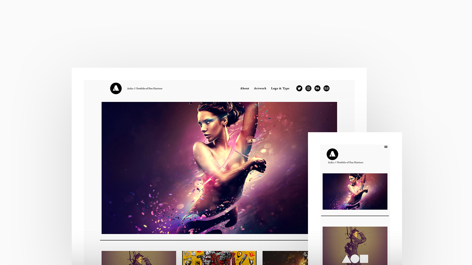
Pete Harrison
Theme: Coburg
Pete Harrison is an award winning Digital Artist and Creative Director from the United Kingdom freelancing under his online alias ‘Aeiko’. He continues to innovate at an exceptionally creative level in both corporate and cultural industries. Pete is using Coburg, with a cover thumbnails homepage and stacked project layout.
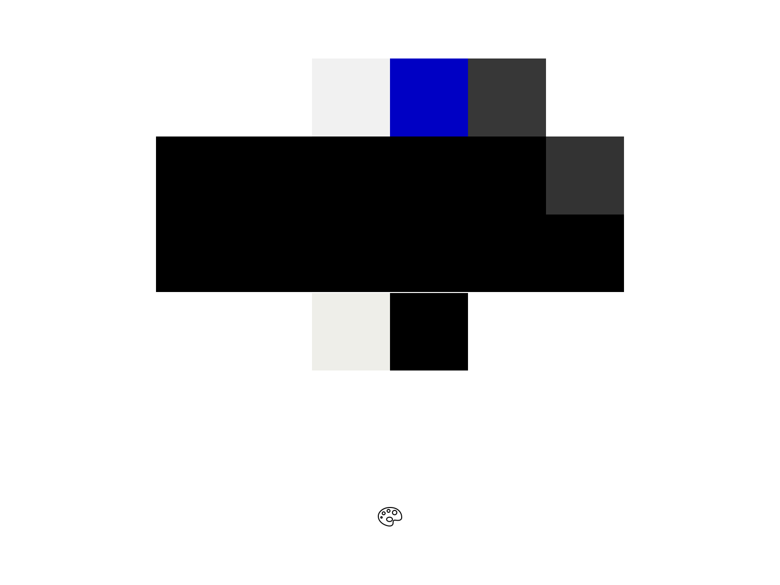
Designers prefer to keep it simple with a light background and dark or pop of color for their text.
Designers tend to display their work with variety of color tones and palettes depending on their creative brief. Keeping a simple light background with black, grey or colored text means they can display a collective of projects allowing their design to take precedent and speak for itself.
Designed to showcase your work perfectly on any device, every Fabrik portfolio site is unique. Get started and create your portfolio website today.
