In Chapter 29 we go behind the work, to reveal the story and the creators. We interviewed Connor Hollman, the producer behind Adidas' groundbreaking GMR ad campaign and Niklas Sundin, illustrator and graphic designer with a prolific portfolio in the music industry.
Adidas GMR
Connor Hollman, Producer, UK
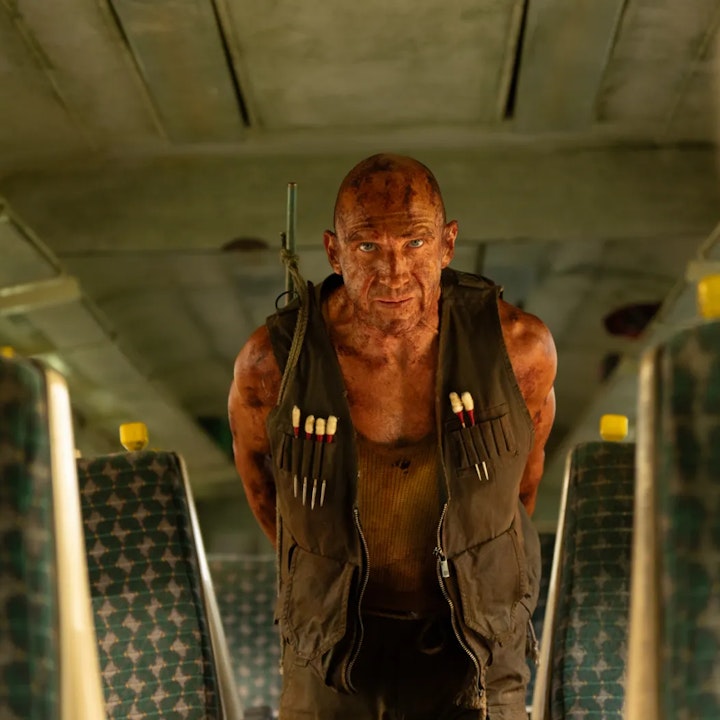
An amazing convergence between real world and gaming skills brought to life by Adidas. A glimpse into a new era of gaming? London-based, freelance producer Connor Hollman helps bring this vision of future to life and now we’re hooked. Here's what he had to say:
Fabrik: Hi Connor! Tell us a little bit more about you and your work and yourself
Connor Hollman: My name is Connor and I am freelance producer from London working in commercials, music videos and short films. The main body of my work is commercials and this ranges across live action, animation and some CG.
I’ve been fortunate enough to work with some great creative talent over the years and at some of the top companies in the industry.
Fabrik: We’ve been impressed by Adidas’ GMR launch. As a producer, would like to tell us a bit more about the overlap of the physical/digital ecosystems and how this translates to your work?
Connor Hollman: When we first received the Adidas ‘GMR’ brief the director (Pedro Martin-Calero) and I were both drawn to the amalgamation of the physical and digital worlds. The idea in its purist form is to challenge gamers to get off of their sofas and actually play the sport, with the reward of improving their OVR in the game.
I think that this has been translated seamlessly into the final film and this is thanks to the fantastic team that was put together. The creative directors and creatives at Adam&EveDDB, Pedro, the crew and the outstanding job Absolute Post did to connect the two worlds.
As this technology develops I am sure we will begin to see a lot more of this physical and digital crossover.
Une Misère - Sermon
Niklas Sundin, Illustrator/Graphic Designer, Sweden
Niklas is a prolific, multidisciplinary creative with extensive experience in the visual arts, as well as in music. Apart from working with clients such as Sony Ericsson, Niklas has been featured in prestigious publications and nominated for awards in both fields.
Fabrik: Hi Niklas! Tell us a little bit more about you and your work and yourself
Niklas Sundin: The short version is that I'm a Swedish illustrator and musician that has been doing a bit of everything in the creative realm. The main focus has been album covers and music related work such as live video projections, t-shirt and stage set design but I've also done a lot of the more streamlined corporate work with everything from logo design to video editing and explainer videos. Up until recently, I was also a member of a heavily touring band, Dark Tranquillity, which allowed me to travel a lot and get inspired by new surroundings and experiences as well as meeting a lot of prospective clients in other bands.
The longer version is I always was drawing and painting as a kid, but the first steps into making it a profession was when enrolling in a multimedia education program in the late '90's. I had already been doing some album cover artwork - mainly detailed b/w ink drawings - but learning Photoshop really opened up a lot of doors, both in terms of exploring new creative territory and acquiring a skill that wasn't very common back then.
In retrospect, some of the aesthetics from that period hasn't aged very gracefully, but it was a very exciting time to be working. The ability to fuse elements from different sources (scanned drawings, photographs, digital painting etc) into something new really felt like being part of something fresh and exciting, but as with a lot of new things the focus on technique easily gets out of hand. If one for example looks at issues of Computer Arts from the early 2000's, it's obvious how everything was so much more "technical" and visually cluttered as a result of all the new tools becoming available, whereas today you often don't have the same problem of the medium getting in the way of the image.
Over time, I grew increasingly interested in motion graphics as it's a format that allows for a deeper sense of storytelling than what a still image can achieve, and I currently split my work about 50/50 between animation and regular illustration. These days, it's very common that clients want both; i.e. if I make an illustration for an album cover, I also can create an animated version that can be used on social media and when presenting the music online.
As for my style, it's always hard to describe one's own work. I've always tried avoiding having too much of a signature style and have instead tried to adopt the visual direction to what the project at hand requires, but I'm sure that there are some elements and tricks that are recurring.
Fabrik: Last month we posted your work for Une Misère - Sermon. Would you like to share a little bit more about the inspiration and what drew you to the project?
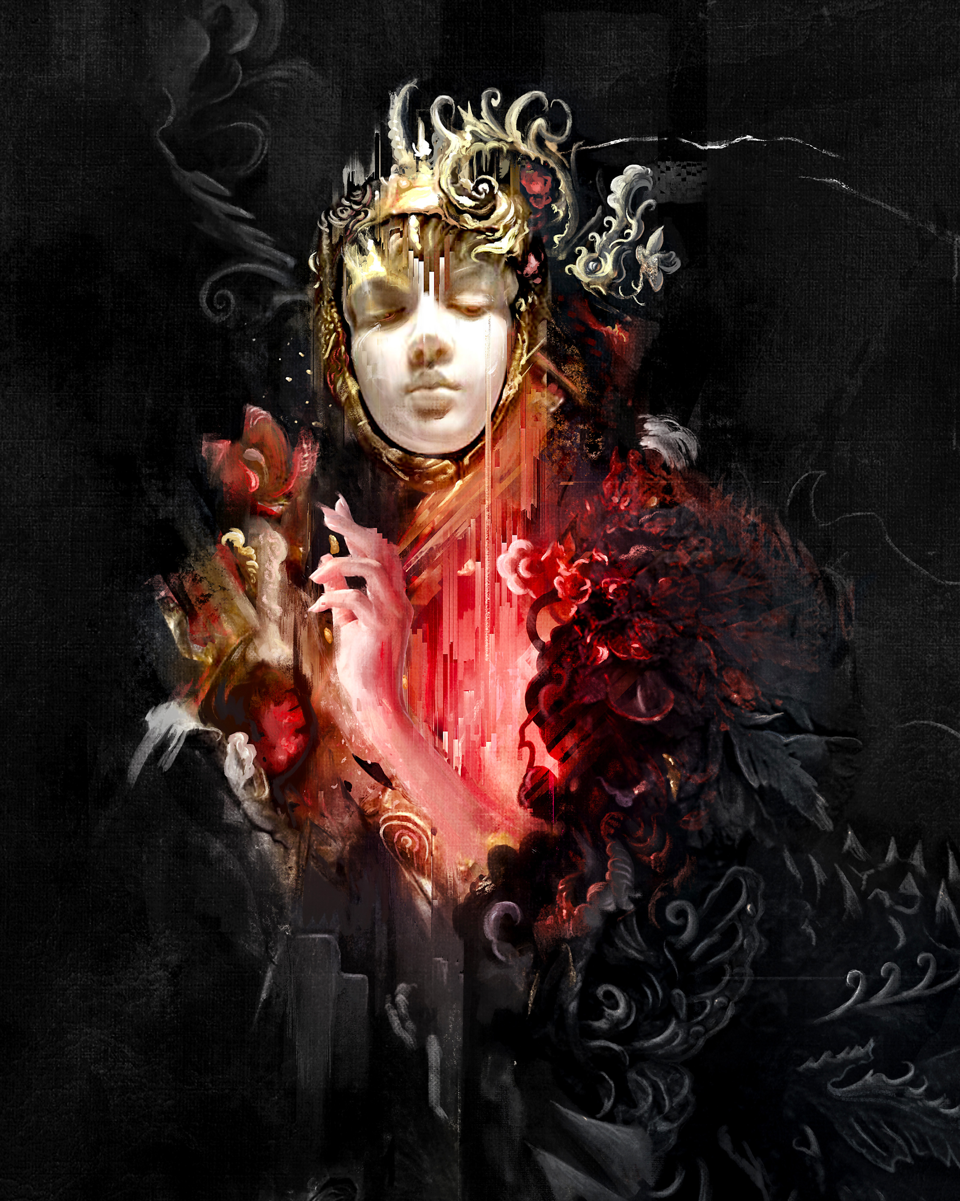
Niklas Sundin: Une Misère is an Icelandic metal band whose music is very eclectic and incorporates influences from a lot of different genres - both new and old. I wanted this diversity to be reflected in the illustration, so as the band requested something that would be relatively simple in composition and also carry a certain regal and solemn feeling, I came up with the idea of making a weird portrait styled image inspired by the renaissance painters. The colour scheme ended up being a bit different than originally planned, so this influence might not be obvious.
I started out by gradually building the image from the face and its ornaments and added more and more components and textures. Technique-wise, I probably don't differ much from how most people arrange digital illustrations these days; lots of layers, patience and my favourite Photoshop brushes from Kyle Webster usually does the trick.
When the illustration felt more or less complete in Photoshop, I actually brought it into After Effects to use the AE Pixel Sorter 2 plugin in order to add a touch of something that's contemporary and trendy at the moment (or at least the moment of creation!), which helped to achieve the traditional vs. modern effect. All in all, I received really good feedback for the project, and a lot of it came from people that weren't previously familiar with my work, which is a great outcome.


