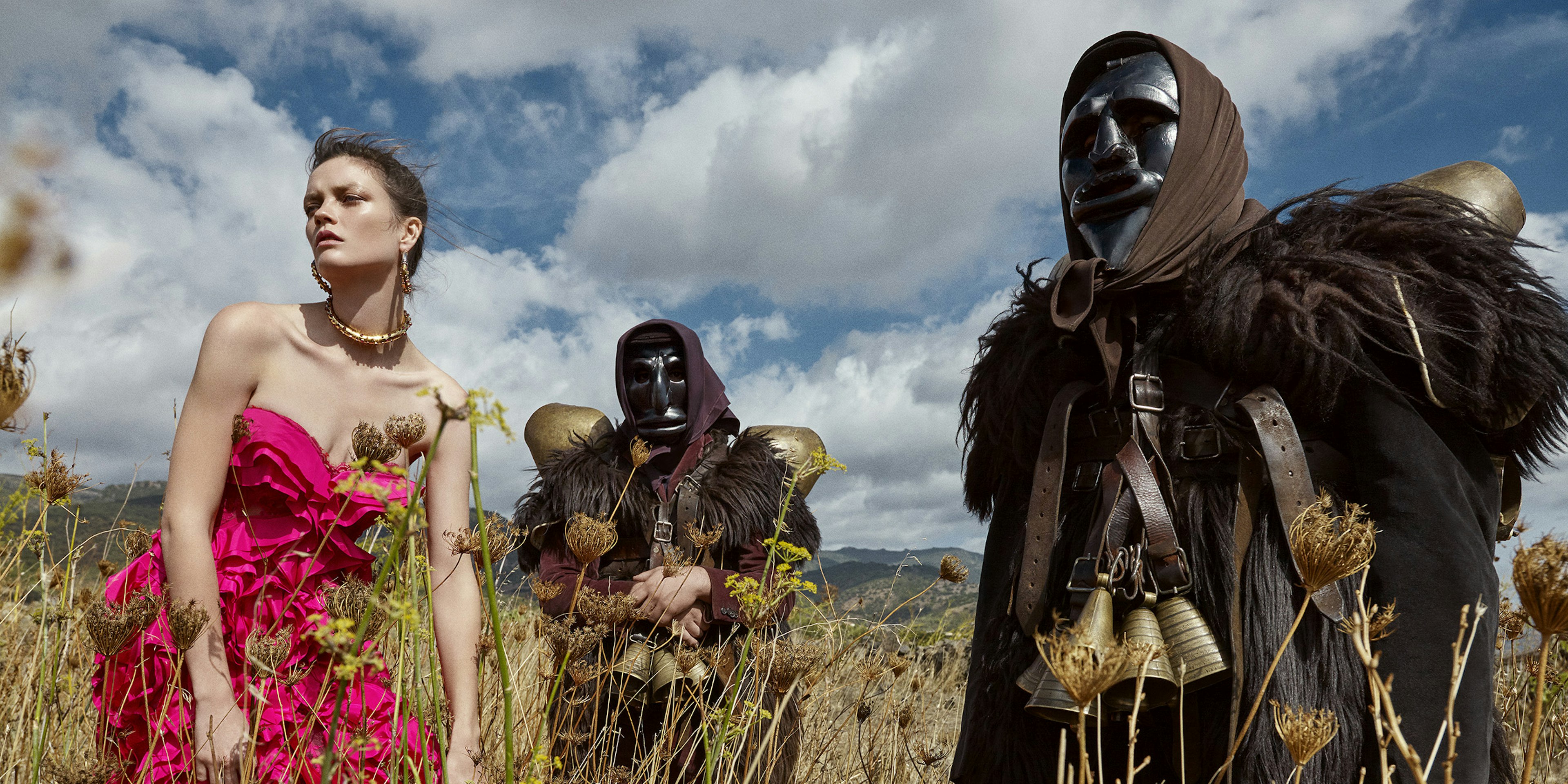
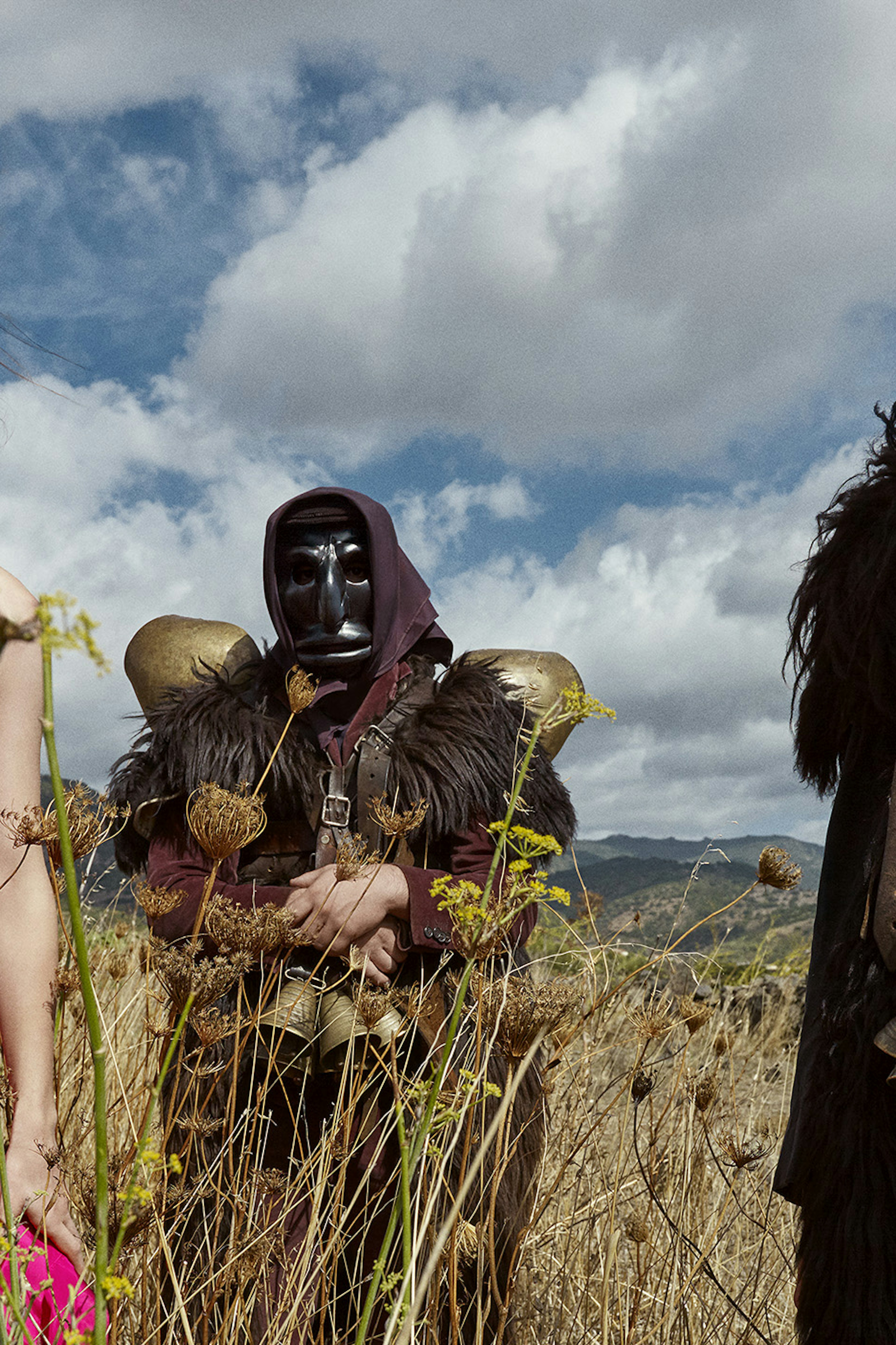
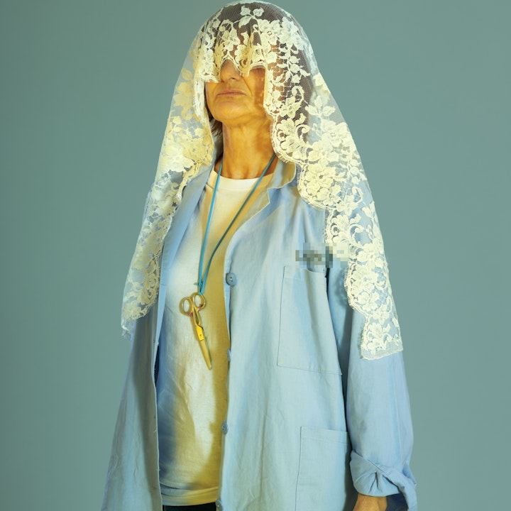
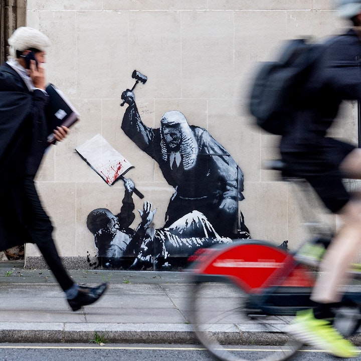
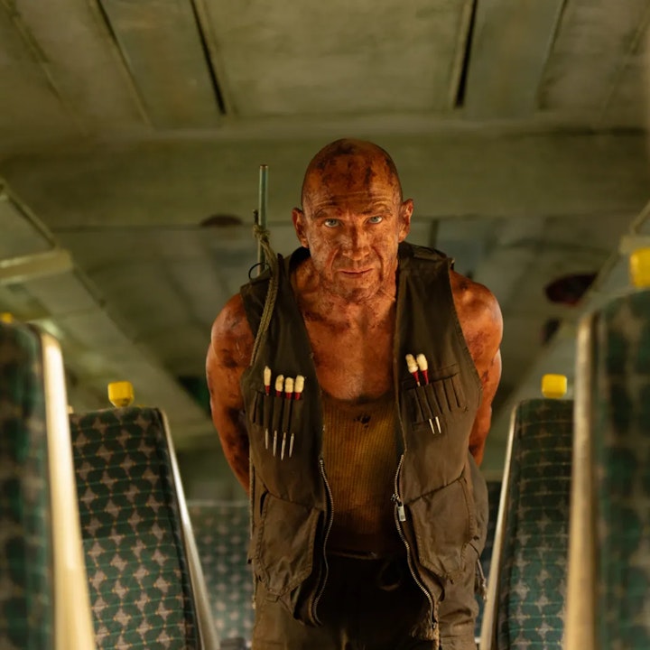
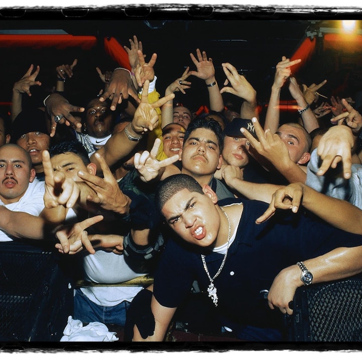
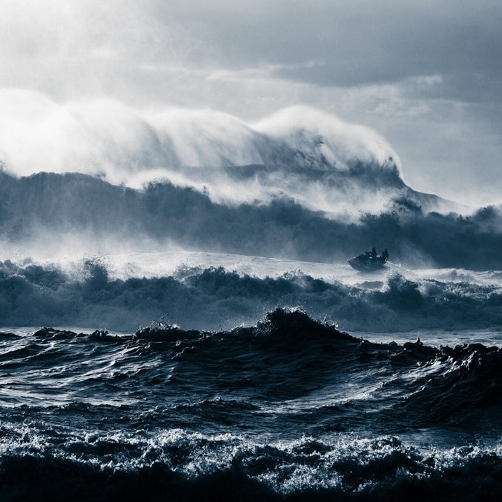
Photographers have a keen eye for detail ensuring that all elements within an image work together harmoniously to convey the right vision and your portfolio should be able to embrace this and do the same. We have curated a selection of leading portfolios from our Photographers along with insights on which characteristics of Fabrik were their top-picks to help inspire and guide you when creating your online portfolio.
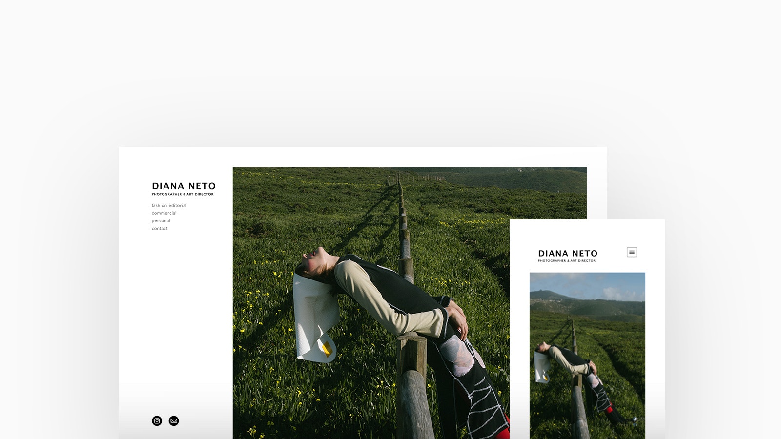
Diana Neto
Theme: Canvas
Diana Neto is a Photographer and Art Director based in Lisbon. The connection between humans and Nature is the essence of her work and is evident throughout her portfolio; the perfect marriage of environment, light and fashion. Diana is using Canvas, with a cover homepage and lightbox project layout.
"Fabrik as a platform is so easy to work with. I personally enjoy the clean design and being able to manage my content quite quickly. Also the fact that you take interest in the creatives that use Fabrik to showcase their work is very welcoming, creates a sense of community and support." - Diana Neto
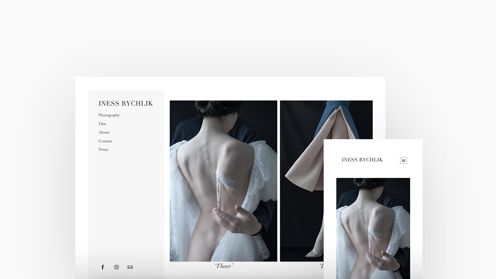
Iness Rychlik
Theme: Canvas
Iness Rychlik is a Polish-born photographer and filmmaker with a particular interest in historical drama. Despite her severe myopia, she has been dedicated to visual storytelling for over a decade. Iness is using Canvas with a strip homepage and project layout.
"I love the selection of Fabrik's templates, which makes it easy to make my portfolio look exactly the way I want it. What I also appreciate is your wonderful customer service; any questions are answered promptly, no matter how silly they might be." - Iness Rychlik
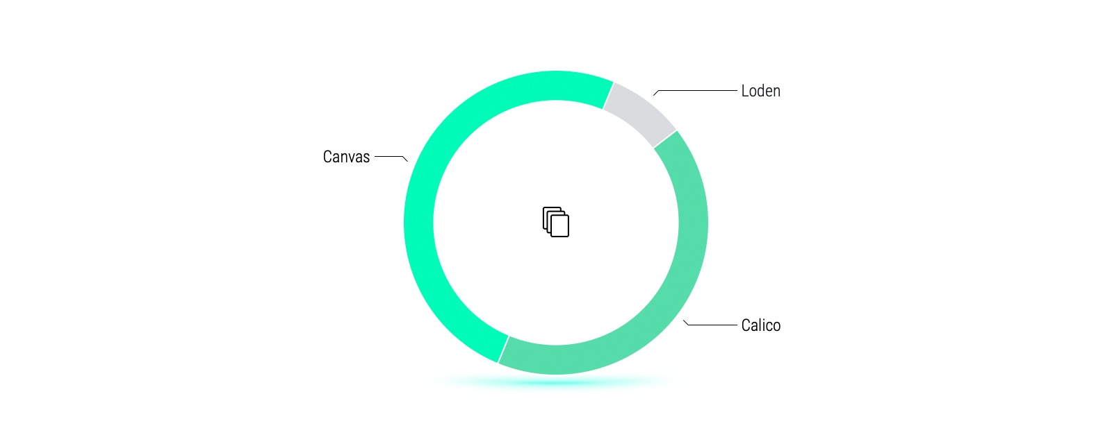
Torn between two themes, the two most popular for Photographers are Canvas and Calico.
With both themes being a great choice for Photographers, Canvas is slightly higher favoured. It is a feed-style theme featuring a sidebar and layout options aimed at providing more control over the placement of text and images and allowing Photographers to beautifully present their portfolio in a multitude of ratios.
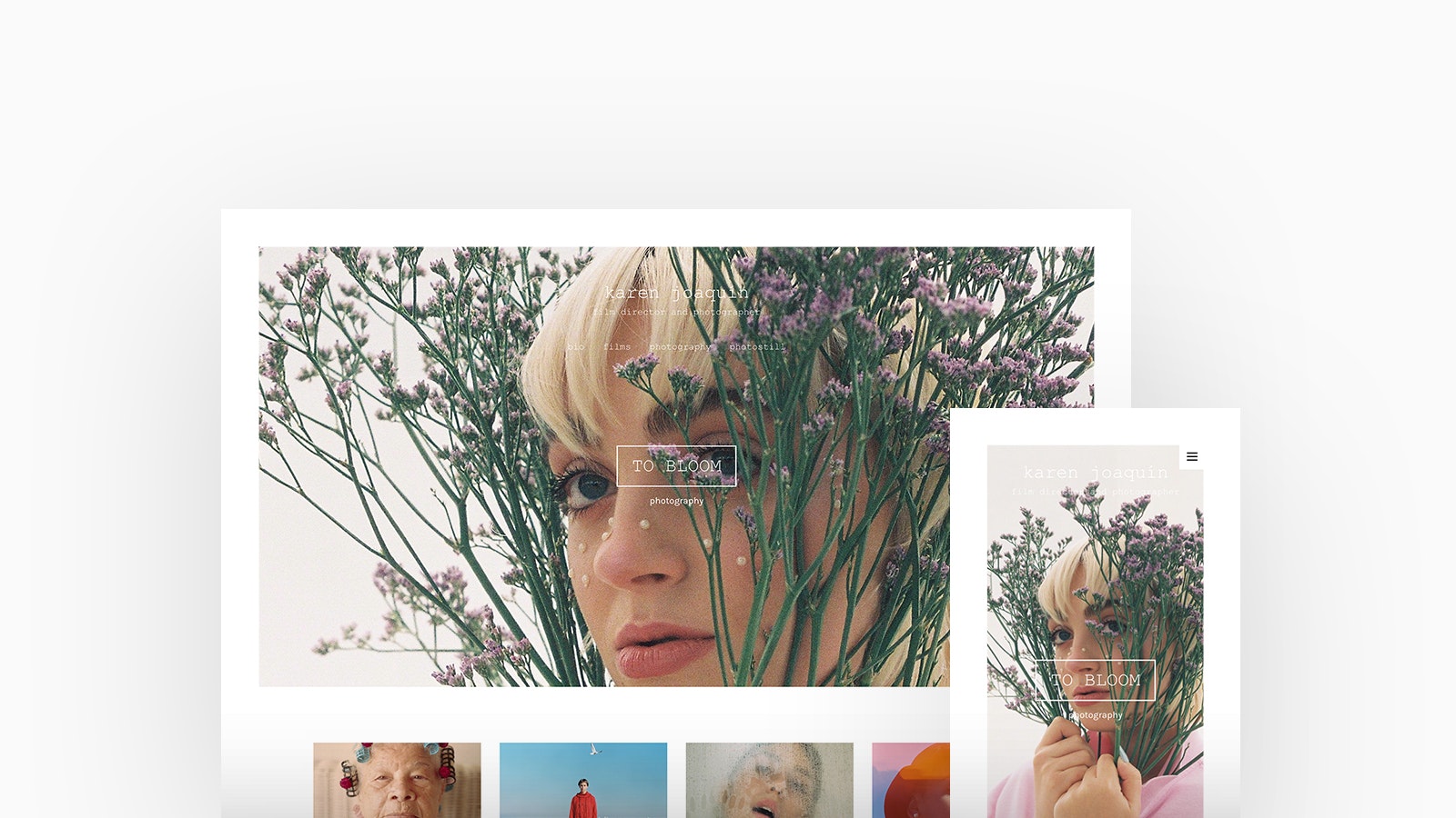
Karen Joaquín
Theme: Tocuyo
Karen Joaquín is a Dominican Film Director and Photographer based in Barcelona, Spain. A multi-artist, she is also a screenwriter, photo still photographer, cinematographer, and advertising copywriter. Karen is using Tocuyo with a cover with thumbnails homepage and stacked project layout.
"I love that I can make it totally my own and I can expose my films and photographs in a simply but representative way. I love the feature of having mini albums in a clearly and understandable gallery." -Karen Joaquín
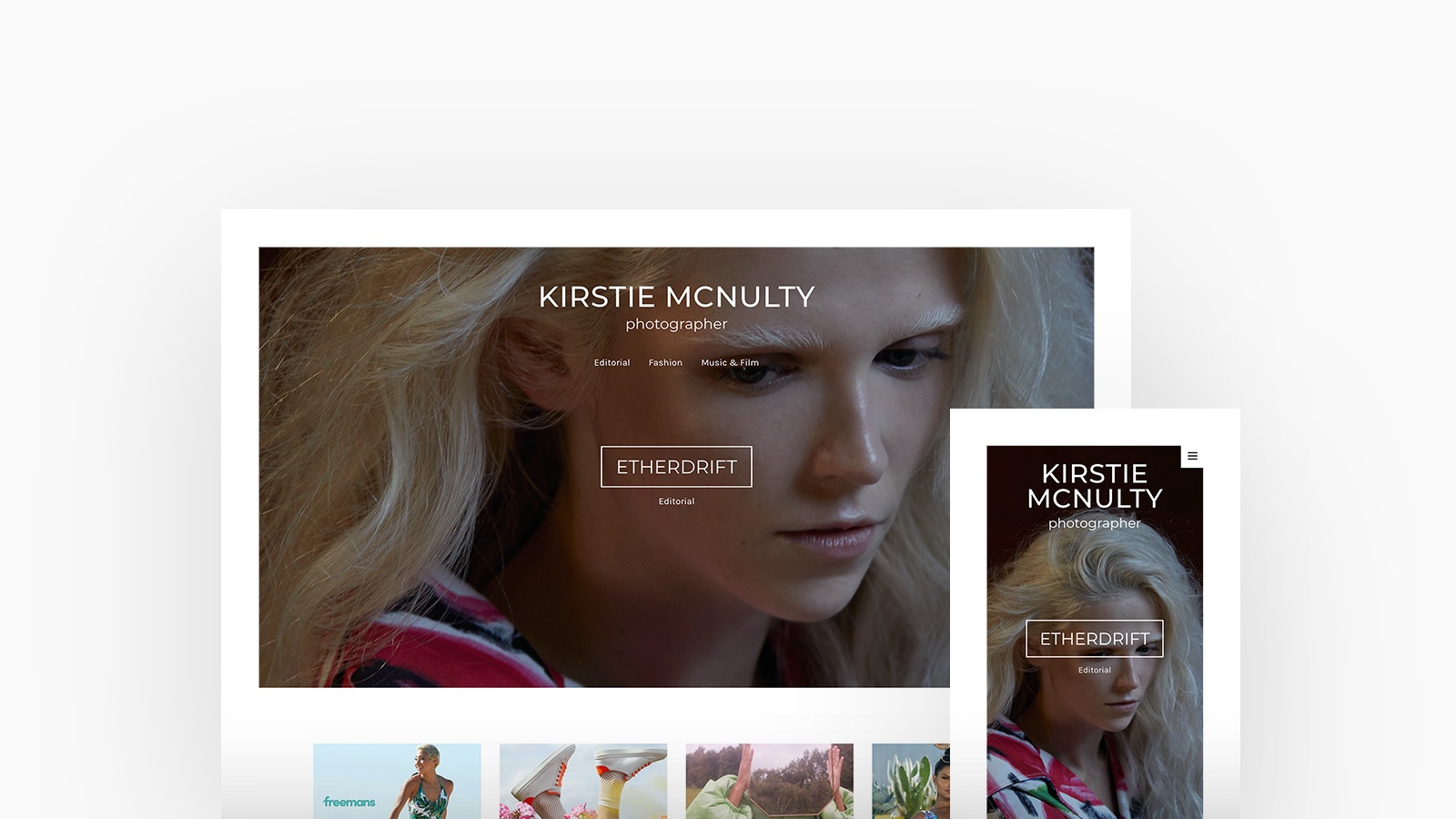
Kirstie Mcnulty
Theme: Tocuyo
Kirstie Mcnulty is a Fashion and Editorial Photographer residing in Manchester, UK. She has captured for fashion brands JDW Fashion and SimplyBe along with having her work is featured in magazines such as; Solstice Magazine, Institute Magazine and Dreamingless Magazine. Kirstie is using Tocuyo, with a cover with thumbnails homepage and stacked project layout.
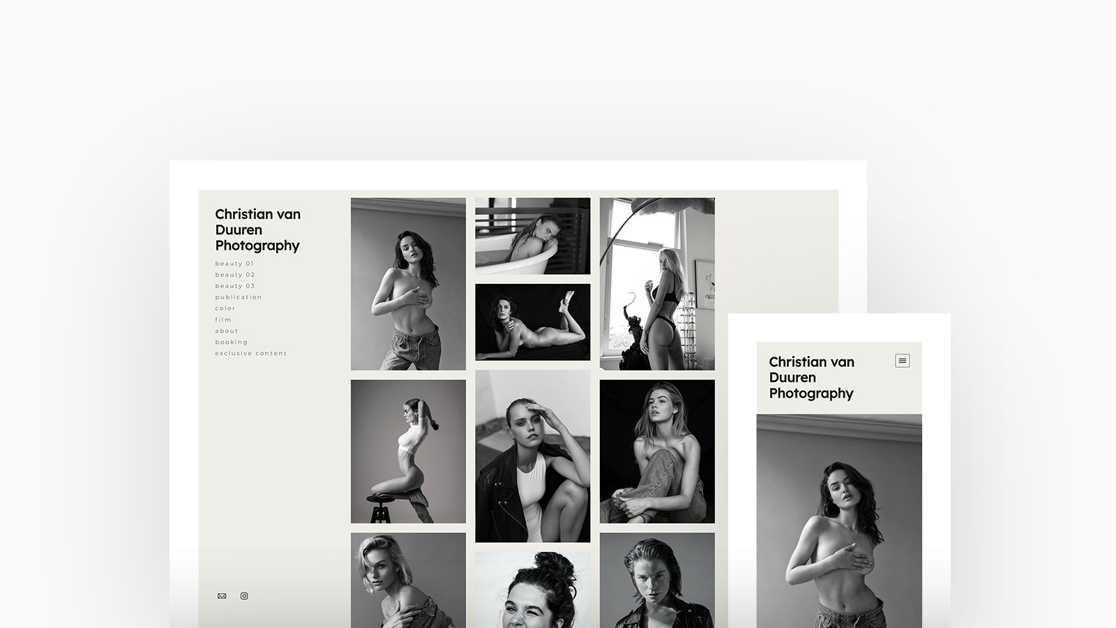
Christian van Duuren
Theme: Canvas
Based in the Netherlands, talented director and photographer Christian van Duuren's series of black and white portraits exude elegance and display the beauty of forms and tones. Christian is using Canvas, with a thumbnails homepage and lightbox project layout.
Discover Christian's Portfolio
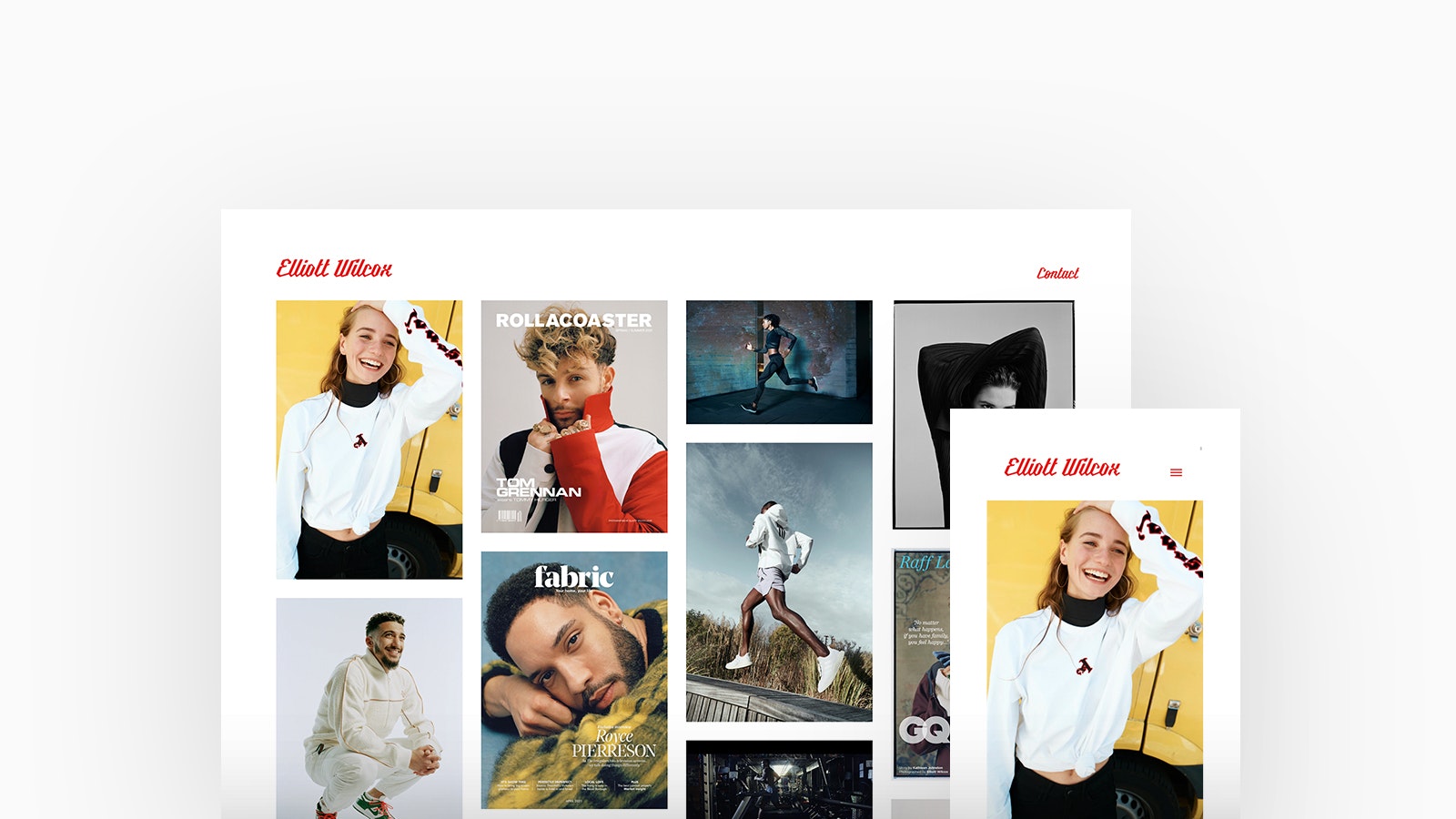
Elliott Wilcox
Theme: Calico
London based Photographer Elliott Wilcox has been the recipient of several prestigious awards and continues to develop his photographic practice and push the boundaries of his medium. Elliott is using Calico, with a thumbnails homepage and stacked project layout.
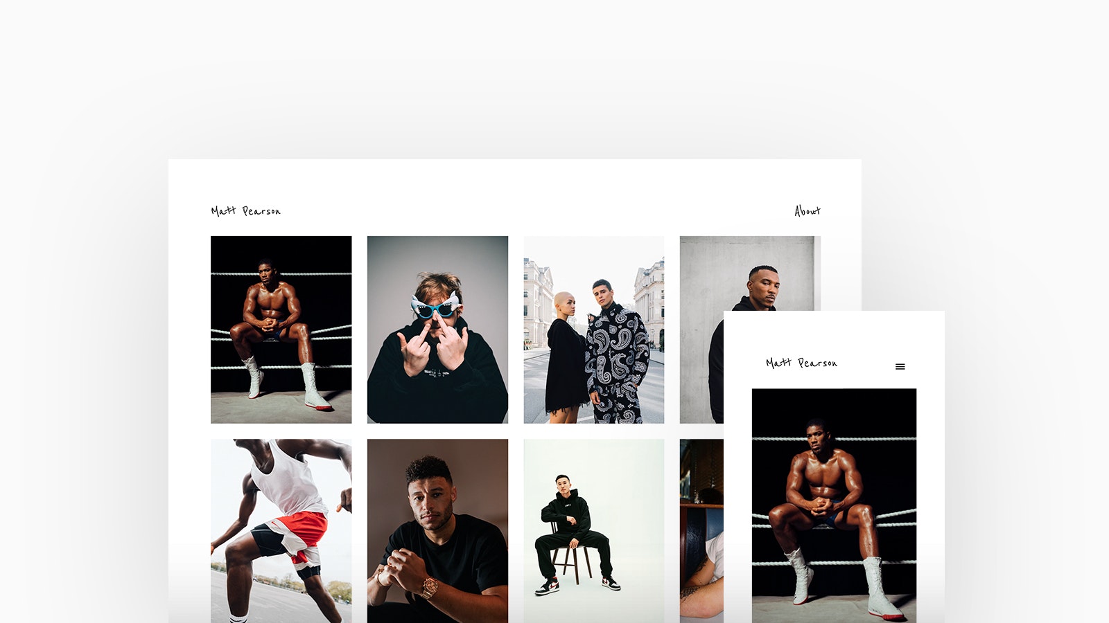
Matt Pearson
Theme: Calico
Matt Pearson is a London based Photographer who has captured the attention of some of the best known names in entertainment and sports. He has a keen interest and grounding in sport and exercise, allowing him to capture movement and people in his own unique way. Matt is using Calico, with a thumbnails homepage and stacked project layout.
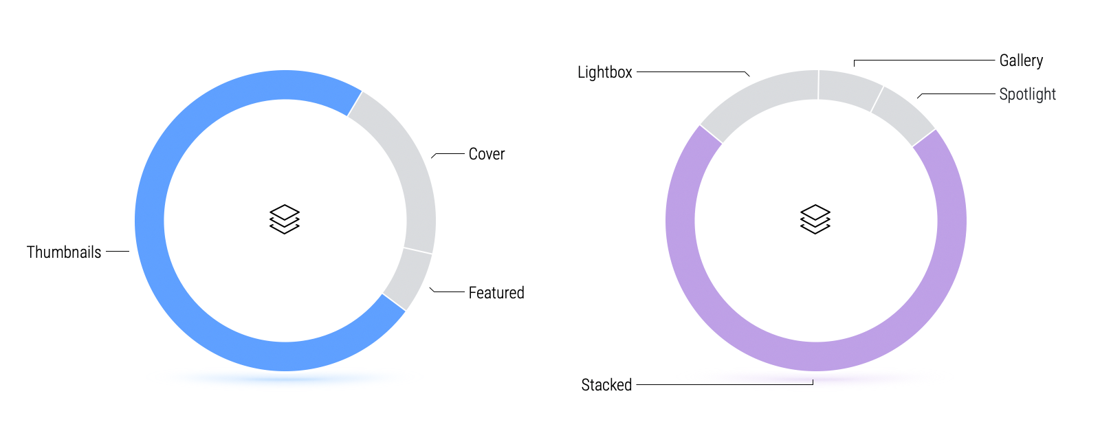
The perfect combination. Our Photographers favour a thumbnail homepage layout with a stacked project layout.
We found a large proportion of Photographers prefer using a thumbnails as it is a great choice for focusing your audience on a single media item at a time, making it a useful layout for viewing imagery with a lot of detail. A stacked project layout is a very simple and forgiving and allows for variety in the types and sizes of media you have.
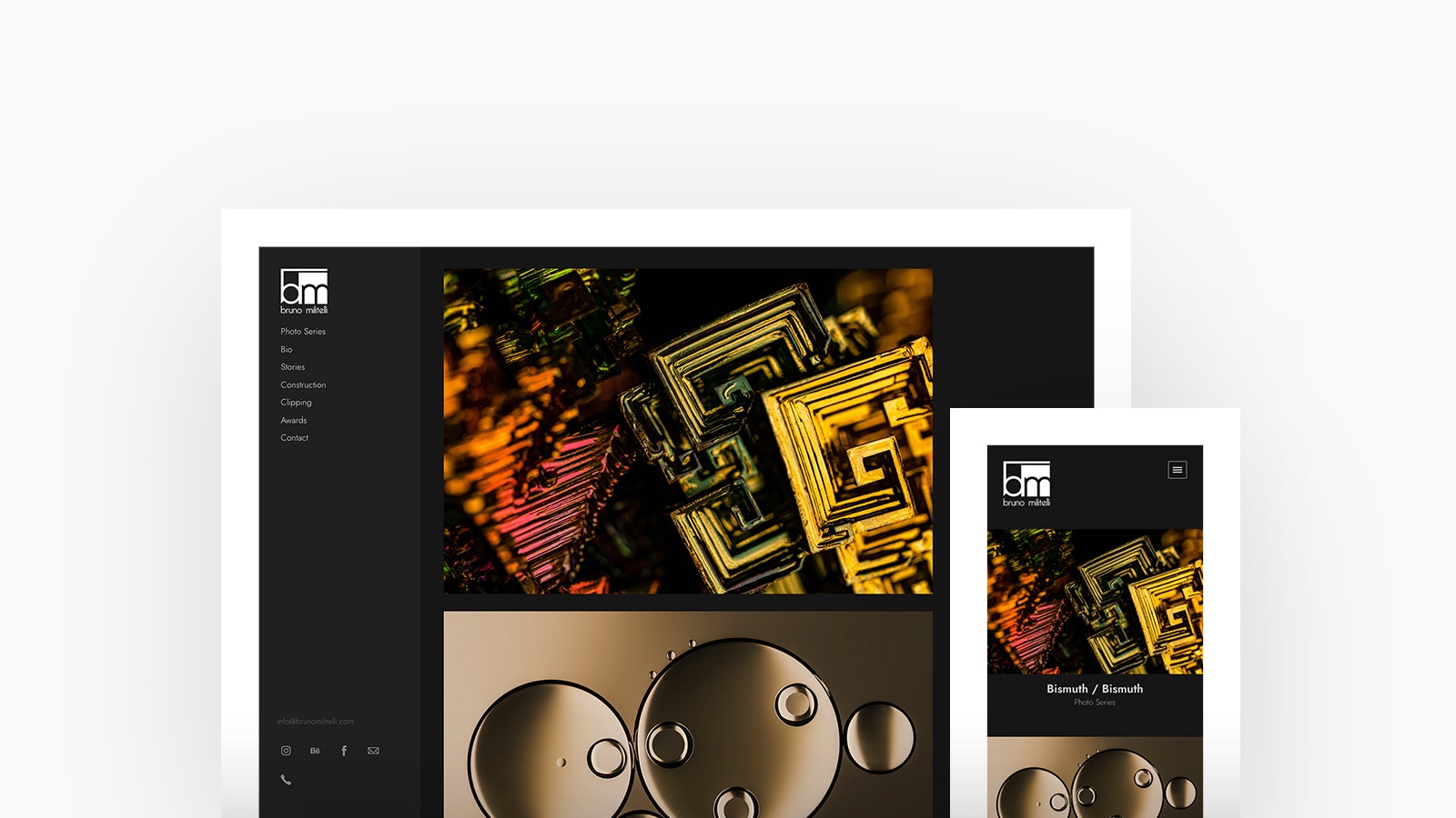
Bruno Militelli
Theme: Canvas
Bruno has a delicate balance between abstraction and allegory and captures nature in its smallest details. Starting from macro photography, he transcends the boundaries of orthologic vision and captures the minutiae of each object photographed. Bruno is using Canvas, with a stacked homepage and slideshow project layout.
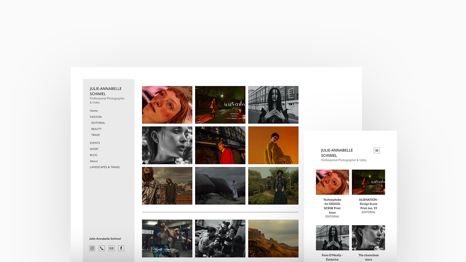
Julie-Annabelle Schimel
Theme: Canvas
Julie-Annabelle Schimel is a Parisian photographer residing in France. She devotes herself to the world of the image: to transmit with technology her dreams, fears and imagination. Julie-Annabelle is using Canvas, with a thumbnails homepage and spotlight project layout.
Check Out Julie-Annabelle's Portfolio
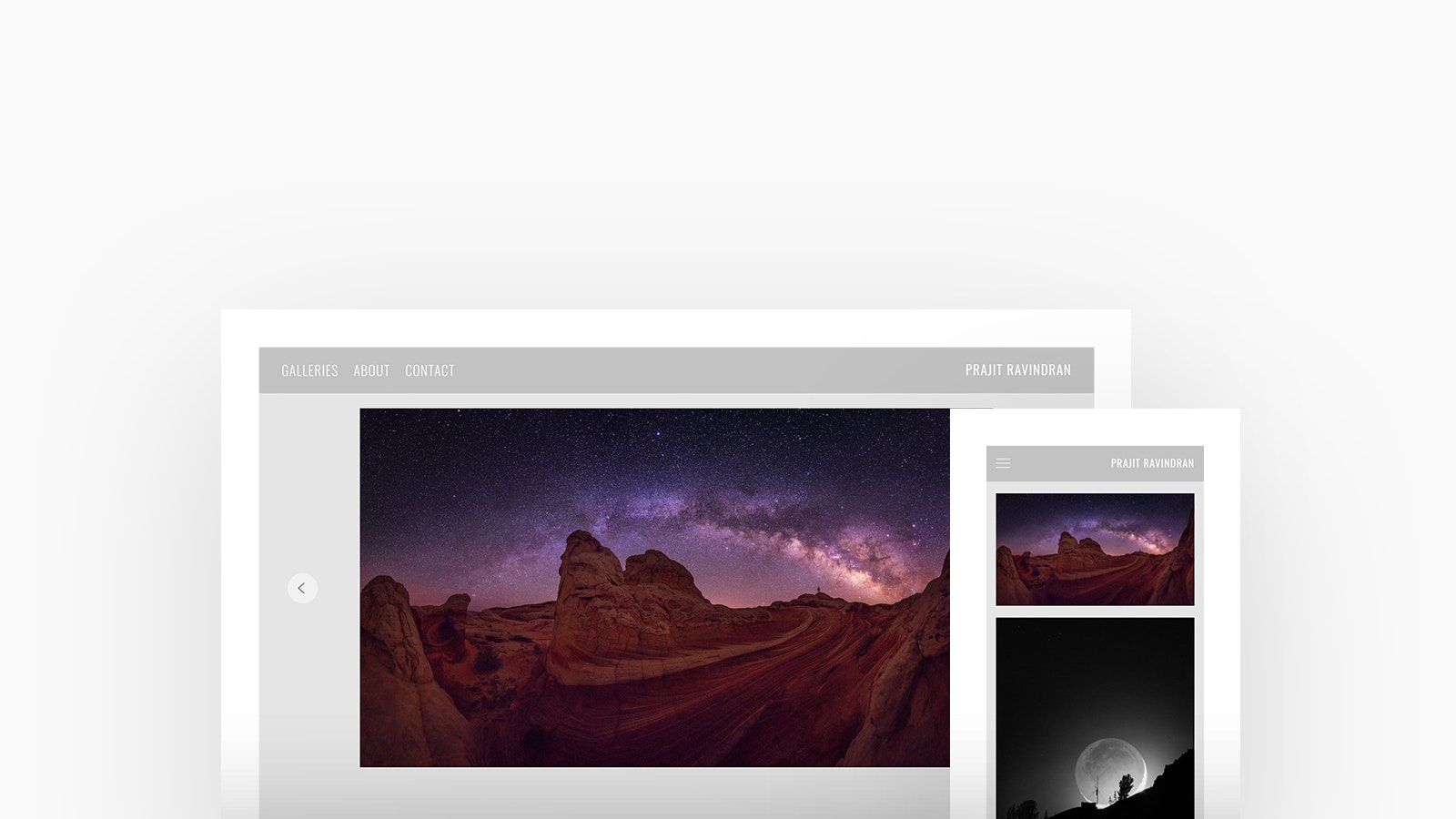
Prajit Ravindran
Theme: Loden
Prajit Ravindran is a Software Engineer by profession and a photographer by hobby and when he moved to Utah, fell in love with the state. Prajit Ravindran has driven for miles exploring the rich, diverse landscape that Utah has to offer and the outcome takes your breath away. Prajit is using Loden, with a featured thumbnails homepage and slideshow project layout.
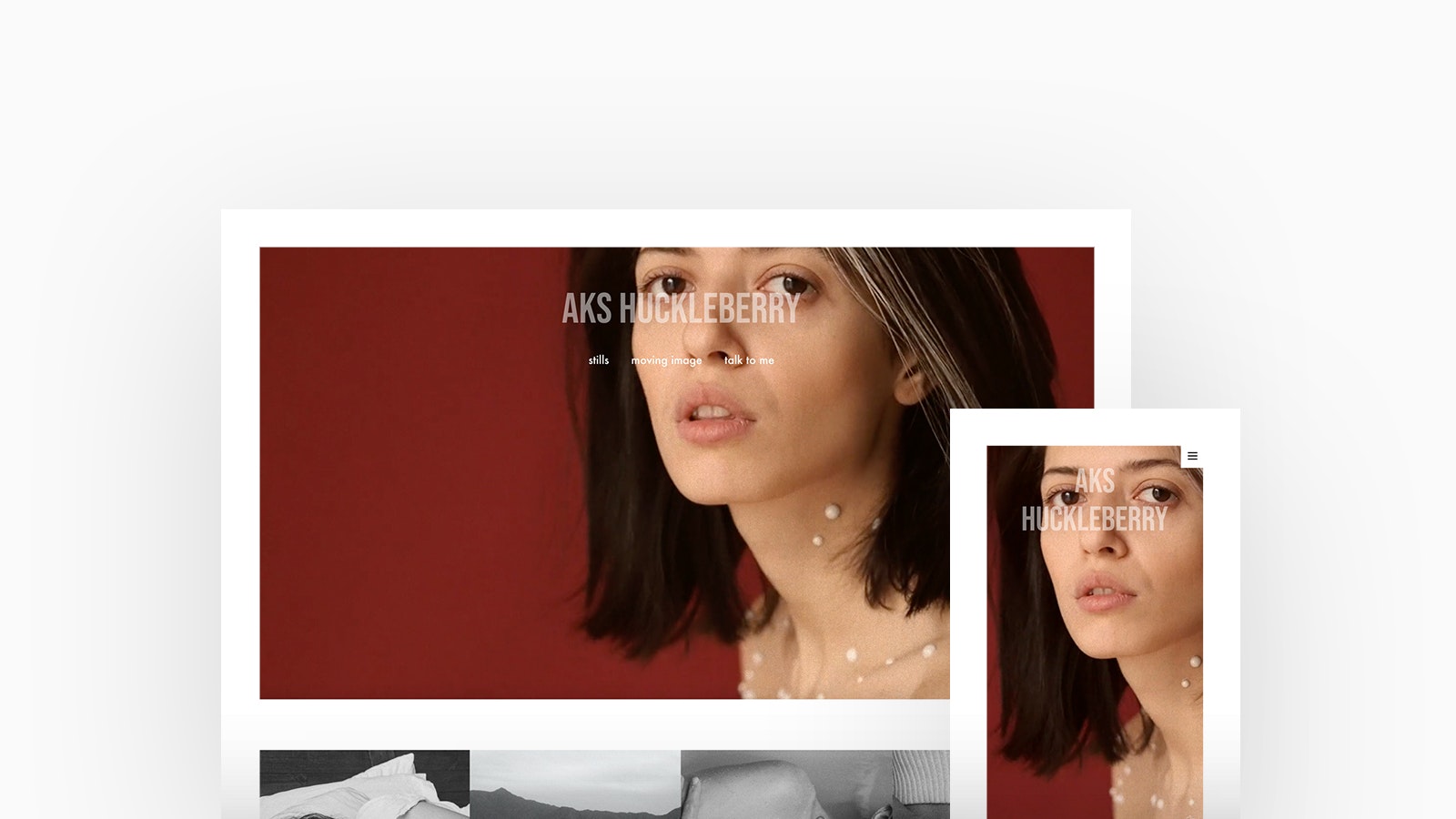
Aks Huckleberry
Theme: Tocuyo
Born in a tiny southern town in Russia, Aks Huckleberry is a young filmmaker and a portrait photographer, who spent her most formative years in London. Aks is using Tocuyo, with a cover with blocks homepage and slideshow project layout.
"My favourite thing about Fabrik is how welcoming and supportive you guys are, especially when it comes to setting anything up on the website. It is rather minimalist in design and easy to use, but occasionally, I did have a couple ideas I wasn’t sure how to bring to life myself and one of you would always come to the rescue." -Aks Huckleberry
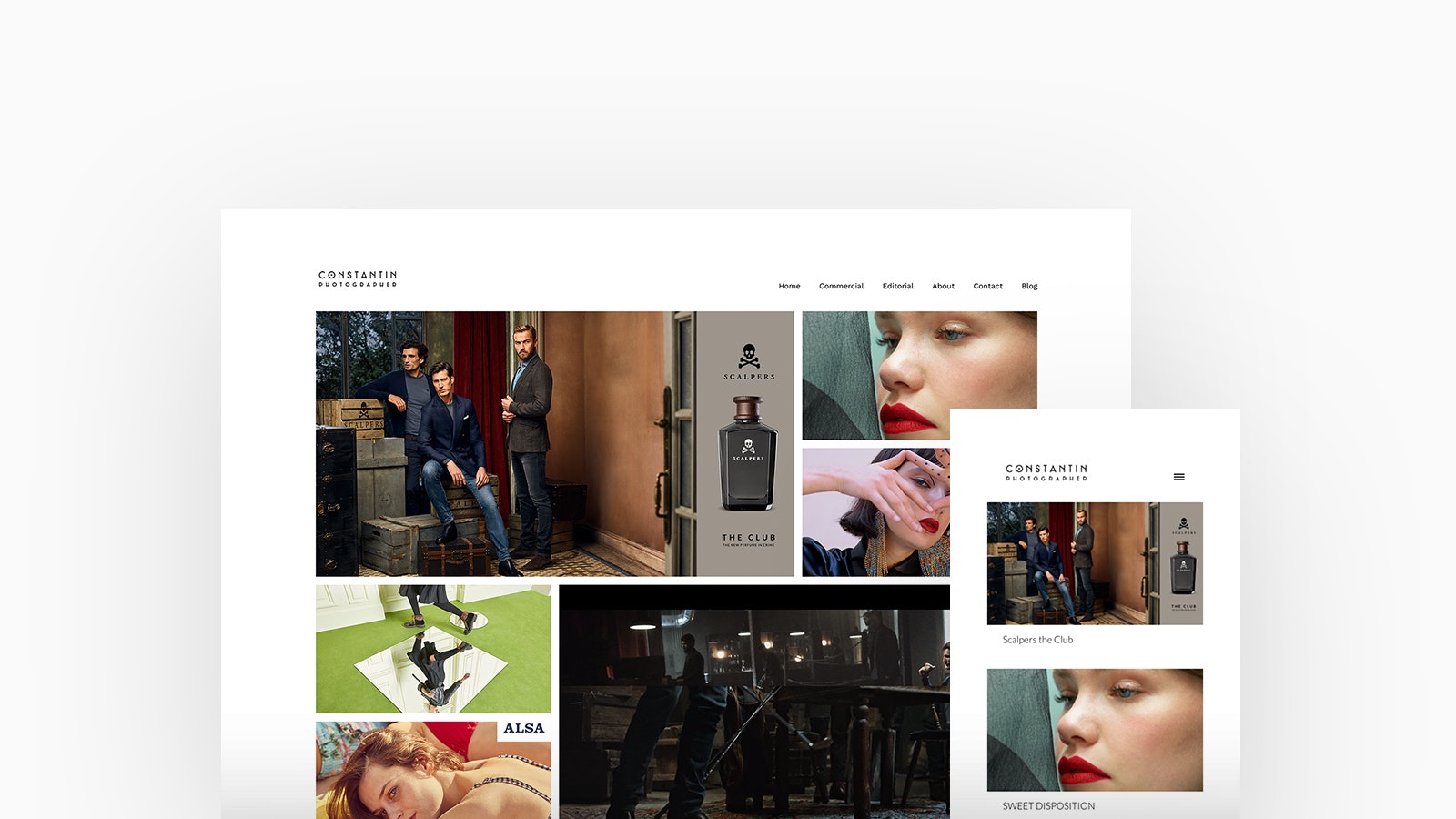
Constantin del Castillo
Theme: Calico
Constantin del Castillo is a Fashion Photographer who creates national and international brand labels campaigns in fashion, beauty and advertising. Constantin is using Calico, with a spotlight homepage and stacked project layout.
Check Out Constantin's Portfolio
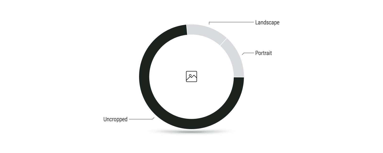
A whopping 73% of Photographers we surveyed prefer their images to be displayed uncropped.
Unlike other creators, Photographers tend to showcase their images in a range of ratios including; landscape, portrait and square. Most opt to display their work uncropped, so that it can be viewed in all its entirety.
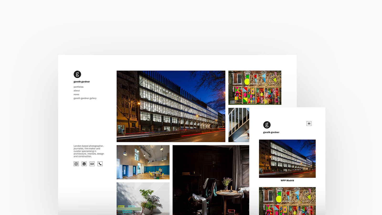
Gareth Gardner
Theme: Canvas
Gareth Gardner is an architectural photographer, filmmaker, journalist and curator based in London. Gareth is adept at examining the built environment and his portfolio is testament to this. Gareth is using Canvas, with a spotlight homepage and spotlight project layout.
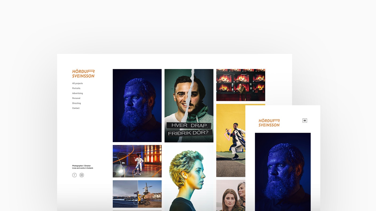
Hörður Sveinsson
Theme: Canvas
Reykjavík based Photographer and Director Hörður Sveinsson specialises in portrait, editorial and advertising photography and video. Hörður is using Canvas, with a thumbmails homepage and stacked project layout.
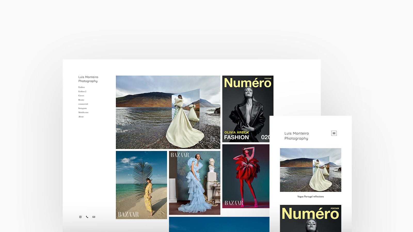
Luìs Monteiro
Theme: Canvas
Born in Portugal , Luis Monteiro moved to London in the year 2000 to pursue his passion for Fashion photography. His photos regularly appear in some of the most influential fashion magazines such as Vogue, Harpers Bazaar amoung others. Luìs is using Canvas, with a spotlight homepage and lightbox project layout.
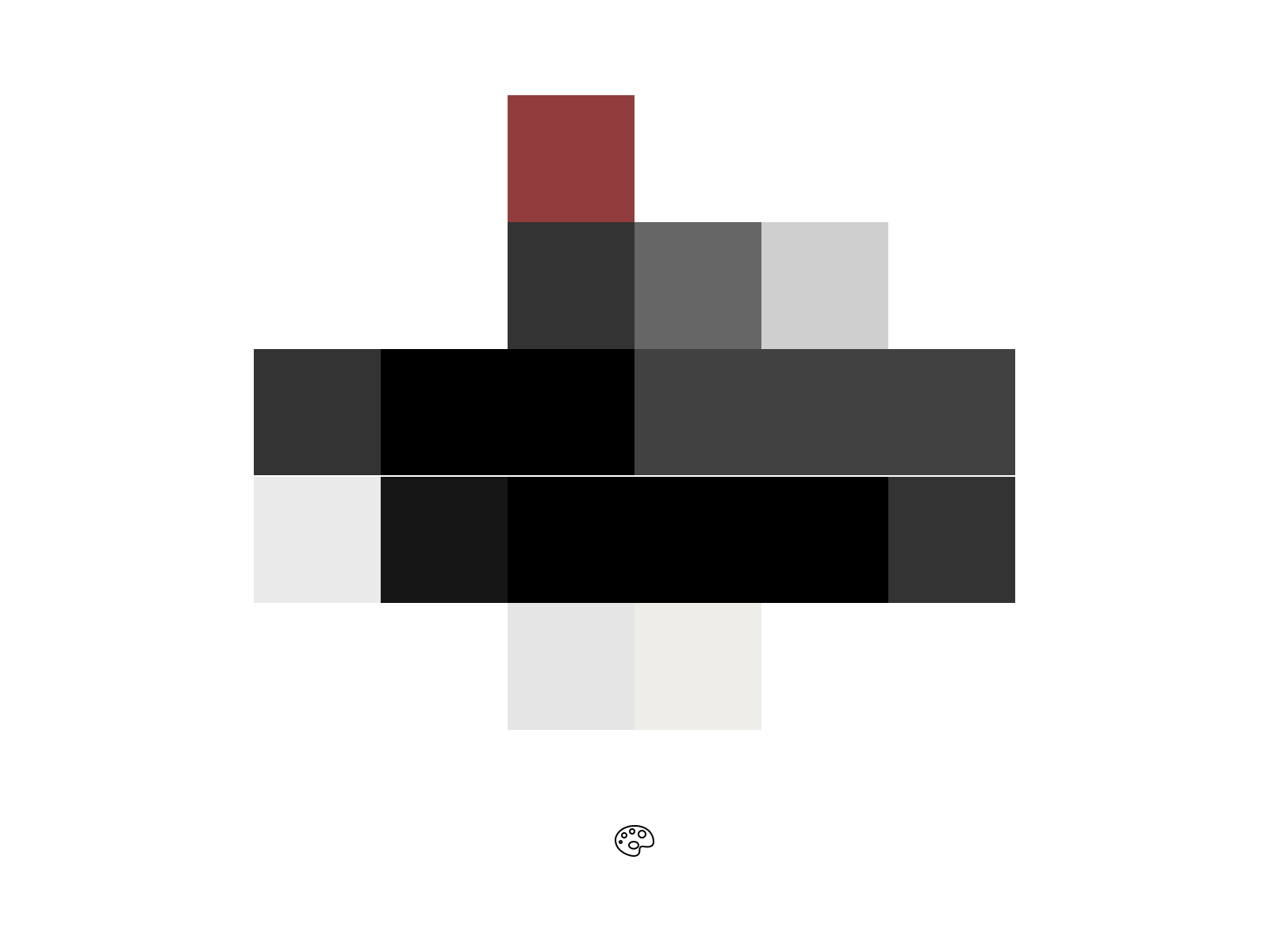
Tones of grey, black or white are prominent colors loved by Photograhpers for use as text or background.
Photographers have a love for a monochrome palette and often opt for a shades of grey, black and white for the background or text throughout their website. A tonal aesthetic emphasises contrast and gives a simple minimalistic look.
Showcase your photography perfectly on any device with a Fabrik portfolio. Start your free trial right now.
