Andrew Popplestone
Interface with the future
View Andrew's design portfolio
Andrew is Creative Director at Territory Studio in London. He is responsible for leading a team of artist and designers in the creation of title sequences, motion graphics and visual effects for feature films, television, commercials and branding. With a background in fine art and graphic design, Andrew is perhaps most known for his outstanding work in modern classic films such as Blade Runner 2049, Ready Player One, Alice Through The Looking Glass, The Help and many more.
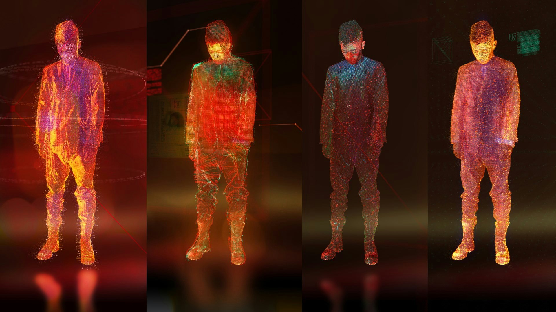
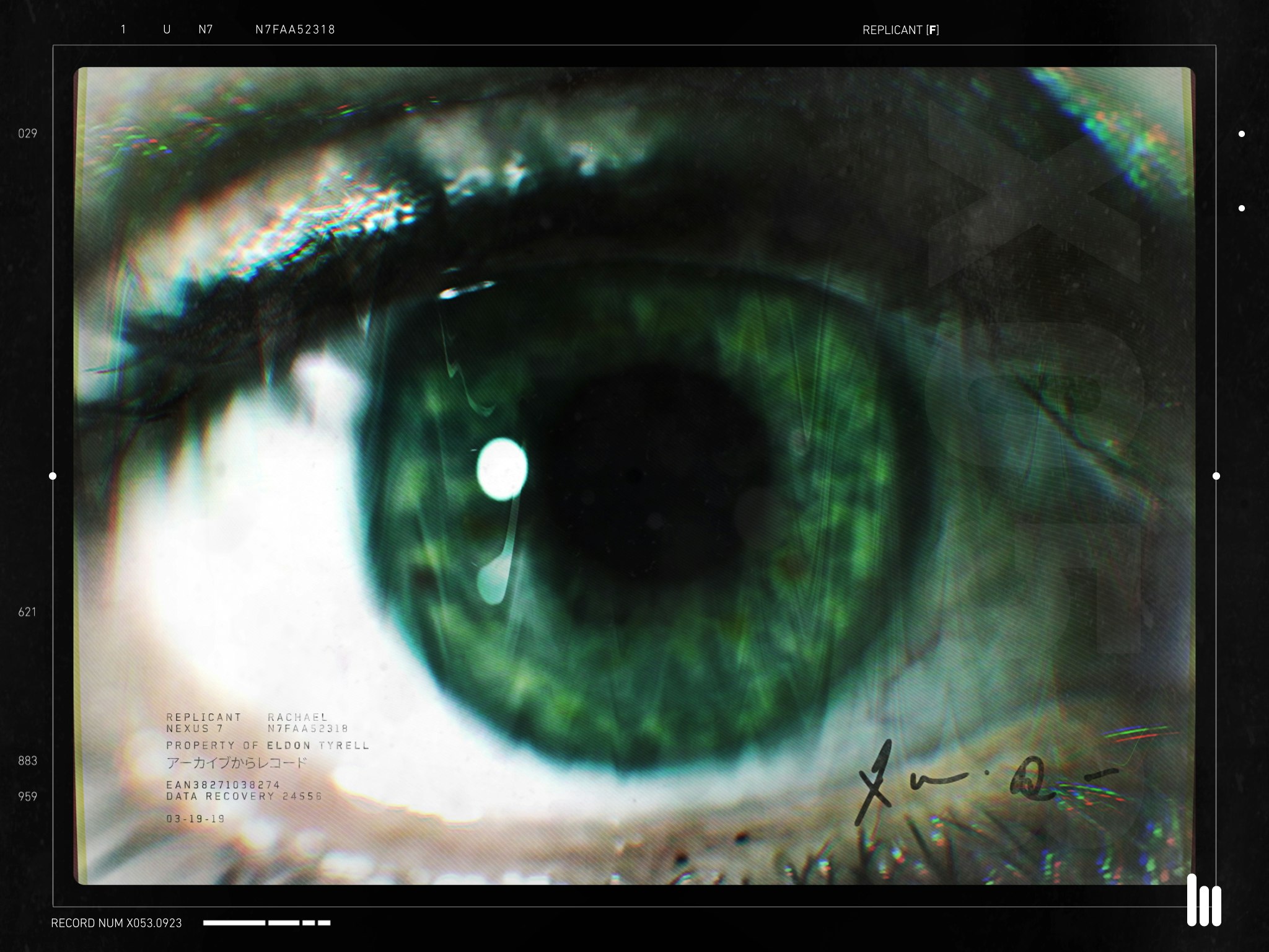
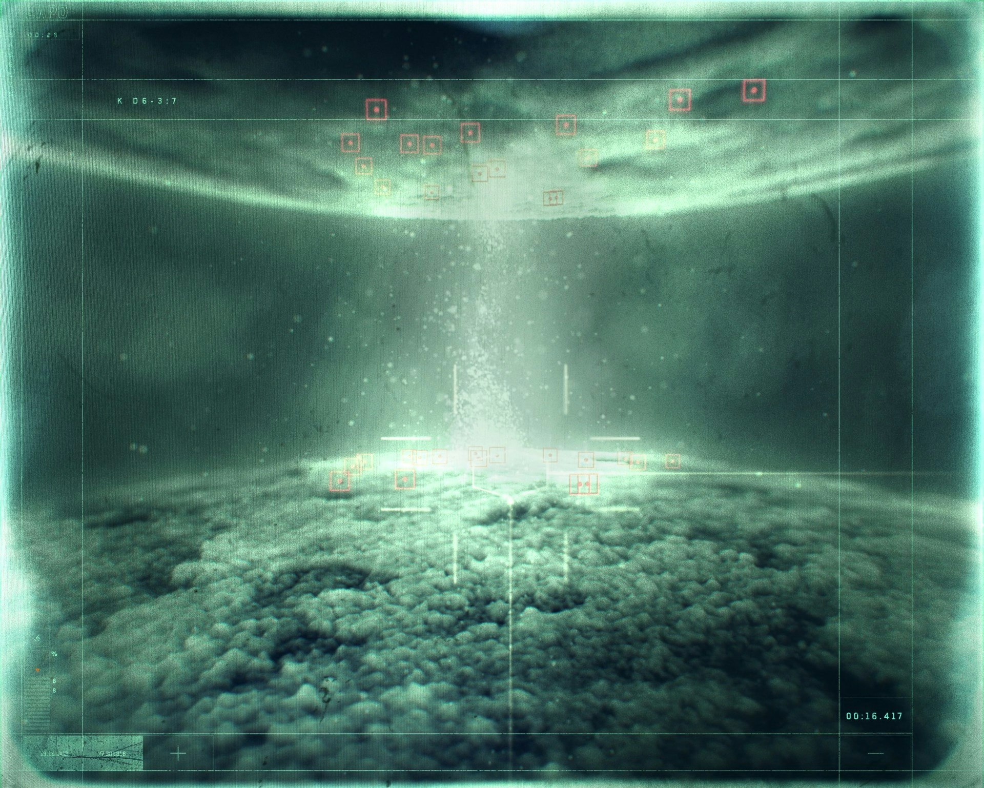
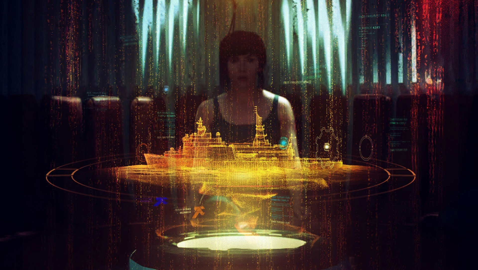
Without losing sight of the big picture and the message of the concept which needs to be communicated, Andrew is known for his meticulous research and the great effort he puts into creating visuals which are authentic, convincing and engaging to the audience. For Blade Runner 2049 the team went at great lengths dissecting and studying objects through macro lenses to discover imperfections and textures that could be used in the screens created for the film.
Andrew’s involvement on Ready Player One (out on Blu-Ray this month), lead the team to create visuals that elevated not only aesthetic, but also consumer expectations, by creating products and interfaces that could see the light of the mainstream market in the near future.
.
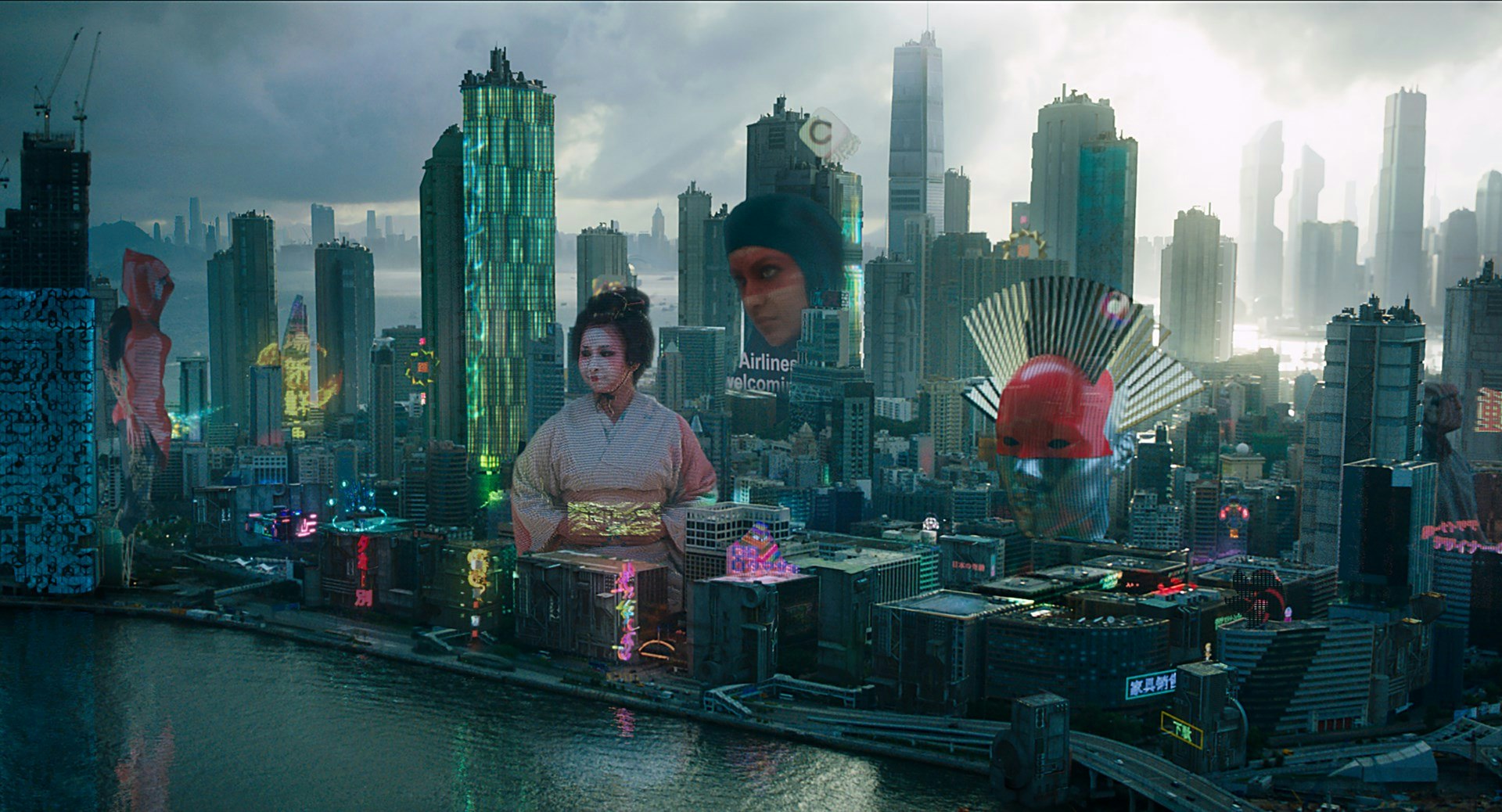
His work has been recognized and lauded in almost all prestigious industry awards. He has received accolades from the Royal Television Society, D&AD, Typographic Directors Club and Promax, working with clients such as Marvel Studios, Disney, Warner Bros, HBO, BBC, HEAD, Adidas, AMC, NBC, Sky, MTV, Playstation, Scott Free, National Geographic, London College of Fashion, Herman Miller.
Busy as he is, he donated a bit of his time to catch up with Fabrik and discuss past and future work, along with anecdotes from his work so far.
Fabrik: You've worked across different genres - commercial and feature. Do you have a preferred one? Is there anything specific trait or treatment that you seek to find in a brief?
Andrew Popplestone: "I love feature film because it's something that can be iconic and timeless. It can live in people’s minds in a way that the commercial genre might not necessarily do. However, commercial projects can also be incredibly fun and rewarding. The way I see it is no matter the genre it’s all creative and an opportunity to tell a story or create something that either hasn’t been done before or that engages and connects with someone on a sensory and emotional level. That’s ultimately what I look for in a brief."
Fabrik: Blade Runner 20149 was last year’s sensation, lauded for its impeccable -and somewhat experimental- aesthetics and visual prowess. How did you go about the research prior to developing your concepts? Were there any specific challenges while working on screens for the film?
Andrew Popplestone: "It started by speaking with the director, Denis Villeneuve at the set in Budapest. He talked about how the world of Blade Runner 2049 had moved on and changed since the first film. As a result he asked us to develop a completely new kind of technology that reflected this, digital tech didn't exist any more so what replaced it...
The new film exists in a bleak dystopian world so we knew the technology had to follow this by being more organic, abstract and physical rather than slick sci-fi. In answer to that we got super experimental moving away from conventional digital/CGI, instead looking at physical handmade, human processes.
Macro photography of fruit, shooting textures through lens', anything with a human element created those imperfections that made the aesthetic feel not only real but inherently part of the bleak world Denis had in his mind. The challenge is always hitting the right tone. Technology is part of the overall world-building and when you get that right and it serves the story, it adds a level of believability and grounding in reality."
"The challenge is always hitting the right tone. Technology is part of the overall world-building and when you get that right and it serves the story, it adds a level of believability and grounding in reality."
Fabrik: Taking cues from Ready Player one, we see a highly successful merge of 80’s nostalgia with products and environments that don’t even exist or exist in a limited capacity. Would you consider your work as a way to set consumer expectations for future technology products?
Andrew Popplestone: "At Territory Studio we specialise in using design and technology to tell stories and often say that we operate at the intersection of those three areas. Filmmakers and directors are constantly looking for new and original ways to tell their story and so ask constantly imagine what technology might look like in the future and design products that don’t yet exist. How does it look, how does it work, how do we interact with it and what impact does it have on the wider world and story in which it exists? It’s not just designing the tech or product itself but the narrative around it.
This experience from the film work then translates into the commercial world because brands come to us asking for the exact same thing. We might help them visualise how their brand could look in the future or how to tell their story using future technology."
Fabrik: Do you ever try creative routes or treatments that look great on paper, but don’t transition to the real, finished article. Are there cases where Territory has to go back and rethink a particular sequence, or tone for a project, and if so, is it something that happens as an organic part of the creative process or is it unusual/rare to deviate from the initial ideas they have?
Andrew Popplestone: "Interesting question and the answer is yes there are time times when we have to go back to the drawing board as it were. Sometimes ideas can develop into something wildly different from what you initially envisaged and then other times the final result that makes it into the film turns out almost exactly like that first mental picture you had.
It might be a case where I think I have a great idea but then once we try to put it into practice it just won't work because it doesn’t fit with another part of the story or it’s over complicated. That’s why simplicity and clarity is so often the best way. It can also be that changes occur outside of our control. The script may change or an actors performance is different. Many things can happen that may change or affect our ideas so we’re always having to re-think and adapt.
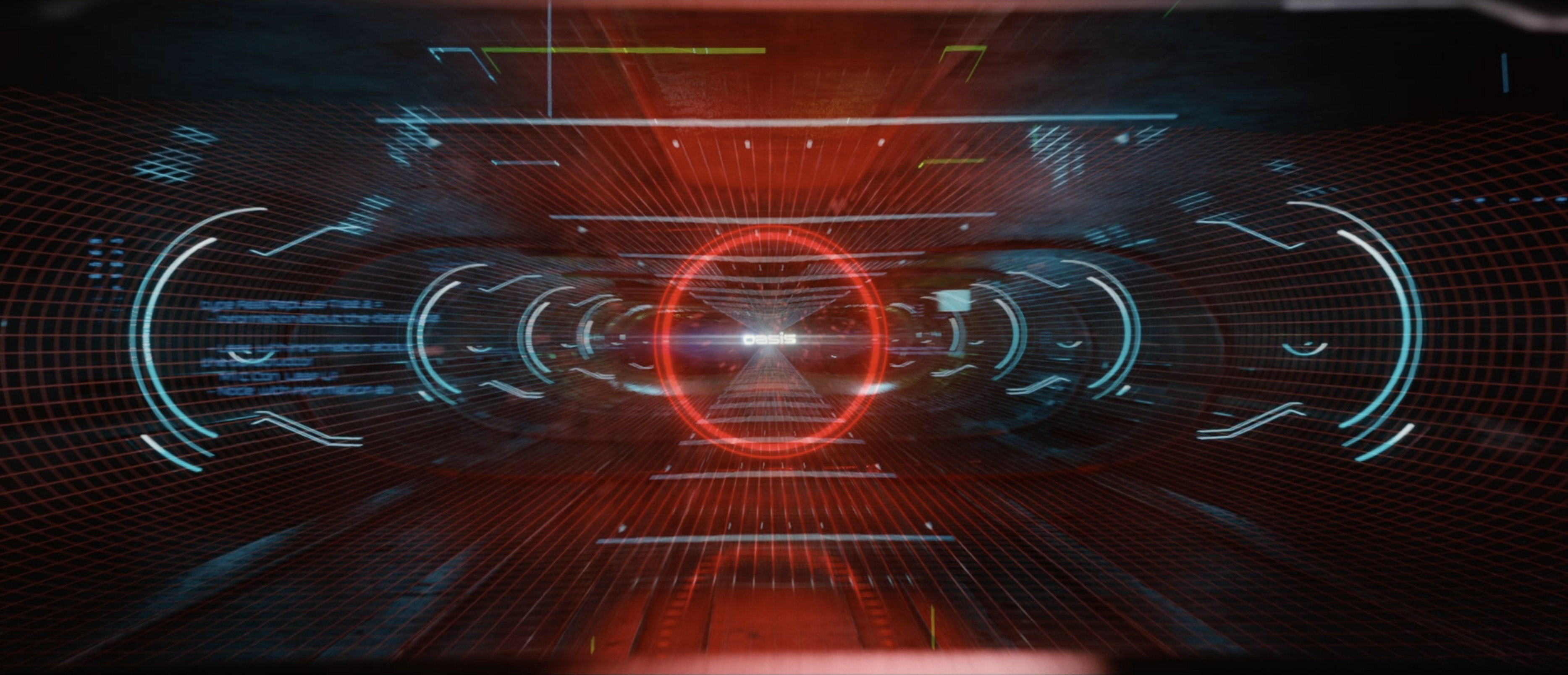
It can also go the other way of course. On Ready Player One for example I had a little idea for the title logo that flashes up as the lead character puts his visor on. We created a couple of animated tests and sent them to Steven. He happened to love them and wanted us to develop it which grew and grew and eventually turned into this big runway/tunnel ‘boot-up’ sequence which takes Parzival from the real world into the Oasis."
"It might be a case where I think I have a great idea but then once we try to put it into practice it just won't work because it doesn’t fit with another part of the story or it’s over complicated. That’s why simplicity and clarity is so often the best way."
Fabrik: Any interesting or fun anecdotes from your time working on projects, or from the reception of your work?
Andrew Popplestone: "What I always find funny about working on films is how people expect it to be super glamorous. I used to live with a good friend of mine who also works in film design. We had an apartment in Notting Hill in London and it always kind of boggled my mind and made me chuckle that Hollywood movies were being worked on on my kitchen table.
When your work is received well by your peers that is lovely and fantastic. However when someone who's completely unrelated to the industry says how they were emotionally engaged in something that you created, that is absolute gold."
Fabrik: Is there any piece of work, be it a film, a song, a painting, that has left you with a lasting impression or any mentors you have encountered throughout the span of your career?
Andrew Popplestone: "When I was 10 my parents took me to go see Jurassic Park at the cinema. I was obsessed with Dinosaurs at the time and spent all my time drawing them. Watching that film I absolutely fell in love with the magic of movies. Then 23 years later I’m working on a Steven Spielberg film creating graphics and visual effects for Ready Player One.
To come back around to work for the person that sparked that love for art and film was pretty special. It completely changed the game for me.
Working with Denis Villeneuve on Blade Runner 2049 was incredibly inspiring. He has such vision and his passion was infectious.
Throughout my career I've been lucky enough to have worked with some of the most talented people in the industry. Learning from people like Kyle Cooper and Erin Sarofsky and then the amazing team we have at Territory. Working with those artists every day is the perhaps the most enjoyable and inspiring part of this job."
"When your work is received well by your peers that is lovely and fantastic. However when someone who's completely unrelated to the industry says how they were emotionally engaged in something that you created, that is absolute gold."
Fabrik: Any advice you’d like to impart on your craft to art directors, motion graphics and visual effects professionals going into the field?
Andrew Popplestone: "It's so easy to get sucked into the details and actually lose sight of the big picture. Simply making something look cool isn't enough. It's all about clarity, make sure you always bring your work back to the concept and story."
Fabrik: Anything you’re working on at the moment that you can share, or any sort of personal directions you’re embarking on that serve your career?
Andrew Popplestone: "A couple of features that unfortunately I'm not allowed to talk about but are very exciting. In terms of personal directions I always try to learn something new and challenge myself creatively by experimenting with new techniques and styles and that often comes from working with different people. For example right now I'm also working on a couple of cel animation sequences for Sky Sports which I'm really enjoying."
"It's so easy to get sucked into the details and actually lose sight of the big picture. Simply making something look cool isn't enough. It's all about clarity, make sure you always bring your work back to the concept and story."
Andrew has a visual storytelling approach that combines concept and narrative, a graphic designers eye and a rich cinematic aesthetic. He's using our Calico theme; a magazine format theme with unique homepage layouts and several project layout options geared towards presenting longer-form projects and blog posts.


